Social Media Picture Dimensions: A 2026 Practical Guide
Learn exact image sizes for social platforms, how to design flexible visuals, and testing tips to prevent cropping and distortion across feeds, stories, and thumbnails with a data-driven approach from What Dimensions.

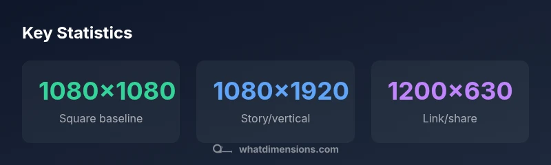
The essential social media picture dimensions vary by platform, but you can start with proven baselines: 1080x1080 px for square posts, 1080x1920 px for stories, and 1200x630 px for link shares. Use flexible templates that keep important content within a central safe zone and design for both mobile and desktop viewing. This approach minimizes cropping and distortion across feeds, stories, and thumbnails.
Why social media picture dimensions matter
In an age of rapid scrolling, the way an image is sized and cropped determines whether a viewer stops to engage or keeps scrolling. Social media picture dimensions shape how your composition reads at a glance, how text remains legible, and how a design translates across devices—from tiny phone screens to large desktop monitors. According to What Dimensions, the right sizes help maintain balance, prevent awkward cropping, and ensure your focal points stay in view even when the platform crops the image during feed sorting. The concept is simple: align your artwork to platform-specific formats, then build flexible templates that adapt without losing meaning. When you design with this mindset, you gain consistency across channels and save time recreating assets for each outlet. The result is a more coherent brand presence that performs well in feeds, stories, and video previews.
Baseline dimensions by format
Different content types call for different aspect ratios, and most platforms will crop if the aspect ratio is off. A practical starting point is to master a few core sizes:
- Square posts (1:1): 1080x1080 px for clean, crisp display on feeds.
- Portrait posts (4:5): 1080x1350 px, which maximizes vertical space without excessive cropping.
- Landscape posts (16:9): 1200x630 px or 1280x720 px, ideal for link shares and wide visuals.
- Stories and short-form video (9:16): 1080x1920 px, delivering full- screen impact on mobile.
These baselines work well for most mainstream platforms, but always check platform guidelines for the latest recommendations. Where exact sizes vary, aim for a high-resolution file (72–150 PPI) and a 2:3 safe zone to protect important content. Build templates that can scale from 1080px to higher widths, keeping essential elements within the central area to avoid edge cropping.
Platform-specific considerations
Platform architecture drives how dimensions perform in the wild. Instagram feeds crop for square and 4:5 formats, while Stories and Reels demand full-bleed vertical assets. Facebook and LinkedIn routinely prefer wider crops for link previews, typically around 1200x630 px. Twitter/X shares favor a 1200x628 px image for a balanced thumbnail. Pinterest often benefits from taller pins, for example around 1000x1500 px, to maximize pin real estate on boards. When designing, think about mobile-first cropping: keep critical text and logos at the center and away from edges that might trim on smaller screens. Always test visuals in light and dark mode if your brand uses backdrop images, as contrast can shift with different UI themes.
What Dimensions emphasizes designing with responsive templates that retain readability and branding across formats. This means creating image families (1:1, 4:5, 9:16) that share a core artboard and differ only in safe margins or bleed areas. The goal is to minimize last- minute edits when assets are rescaled or cropped by a platform’s algorithm. By embracing consistent baselines, you reduce friction across campaigns and maintain visual integrity across devices.
Designing flexible graphics and templates
Your templates should flex without losing meaning. Use vector-friendly assets for logos and key shapes, and export raster images at high resolutions to avoid pixelation when cropped. Build design grids that preserve center alignment; keep all essential elements (text, logos, faces) within a central 80–90% safe area so edge crops never obscure critical content.
Create aspect-ratio-specific variants from a single master file. For example, derive a 1:1 square, a 4:5 portrait, and a 9:16 story from the same composition. Maintain consistent font scales and line lengths so the typography remains legible across formats. Use descriptive file naming like brandname-format-date-aspect to streamline asset management. Finally, maintain color balance and contrast to ensure legibility on bright mobile screens and in dim environments.
Testing and optimization
Testing is essential after establishing baselines. Preview images on multiple devices—phones of different sizes, tablets, and desktops—and simulate various feed placements to spot cropping signs. Leverage platform-native previews (e.g., Instagram’s post composer, Facebook’s link share debugger) to confirm that key elements stay visible in the feed. What Dimensions recommends validating both orientation-specific and cross-orientation performance; ensure your graphics retain impact when scaled down to thumbnail sizes.
A/B testing can help refine typographic size, iconography, and spacing. Track engagement metrics (click-throughs, saves, shares) as a proxy for readability and emotional resonance. Use these insights to tighten margins, reposition critical copy, or simplify artwork so it communicates at small scales. The overarching principle is to iterate: keep what works, modify what crops, and discard what never resonates with your audience.
Common mistakes and quick fixes
Even experienced designers slip into common traps. Here are quick fixes to keep assets robust:
- Dig into platform guidelines before finalizing files. If a platform crops aggressively, shift important content toward the center.
- Avoid long passwords of tiny type; scale fonts for readability at 1080px-wide displays.
- Stick with a single master template and generate variations via safe-zone rules rather than re-creating from scratch.
- Don’t rely on a single size; maintain multiple aspect ratios so you’re prepared for any channel.
- Double-check color contrast against white or light backgrounds to ensure legibility on dark themes.
These tweaks reduce rework and help your visuals perform consistently across channels.
Implementation checklist and best practices
- Define core aspect ratios (1:1, 4:5, 9:16) and create master templates.
- Build a centralized asset library and naming conventions for quick reuse.
- Validate images on mobile and desktop previews, checking for edge cropping and legibility.
- Establish a routine to verify platform guidelines quarterly as specs may evolve.
- Implement automated export presets to preserve quality across formats, ensuring compliance with size and file-size limits.
- Keep a content calendar that aligns with platform-specific posting times and content types to maximize engagement.
Common social media image sizes by platform
| Platform | Common image dimensions | Notes |
|---|---|---|
| Instagram feed (1:1) | 1080x1080 px | Ideal for square posts with bold visuals |
| Instagram stories (9:16) | 1080x1920 px | Full-screen vertical; keep text centered |
| Facebook shared image | 1200x630 px | Good balance for link shares |
| Twitter/X shared image | 1200x628 px | Optimized thumbnail for feed |
Quick Answers
What is the most versatile image size for social media posts?
1080x1080 px is the most versatile for square feed posts. It keeps content legible when platforms crop and scales well across devices. Pair it with a central safe zone to protect key elements when switching to other aspect ratios.
1080 by 1080 is the go-to square size for many feeds and scales well across devices.
Do stories require different dimensions than feed posts?
Yes. Stories require full-screen vertical assets, typically 1080x1920 px, to fill the screen without letterboxing. Always place essential content toward the center to avoid cutoffs by the platform’s UI.
Yes, stories need 1080 by 1920 for full-screen impact.
Should I design for 4:5 or 1:1 aspect ratios?
A balanced approach is to design both 1:1 and 4:5 variants from a single master. 1:1 works for square feeds, while 4:5 maximizes vertical space in some feeds without excessive cropping.
Create both square and portrait variants so you’re ready for any feed.
What about thumbnails for YouTube or video previews?
YouTube thumbnails typically use 16:9 with 1280x720 px guidance. Clear imagery and legible text help viewers decide to click.
Video thumbnails usually need to be 1280 by 720 for best results.
How often do platform specs change?
Platform guidelines change occasionally. It’s smart to review official guidelines quarterly and refresh templates if needed to prevent cropping or reduced quality.
Platform specs can change; check guidelines every few months.
“Exact image dimensions help maintain composition and prevent cropping surprises across feeds.”
Main Points
- Start with platform baselines: 1080x1080 for square, 1080x1920 for stories, 1200x630 for link shares
- Keep critical content within the center 80–90% safe area to prevent cropping
- Design flexible templates that can be derived into multiple aspect ratios
- Test visuals on mobile and desktop using native previews
- Update templates as platform guidelines evolve to prevent misalignment