How to Make Image Dimensions Smaller
Learn practical, step-by-step methods to reduce image dimensions without sacrificing quality. This guide covers pixel resizing, compression, and platform-specific tips, with a repeatable workflow you can apply to photos, graphics, and logos.

Goal: you will learn how to make image dimensions smaller without sacrificing essential quality. You’ll resize by pixels, choose appropriate resampling, and apply compression for web and print. Before you start, have the original image, a target use case, and your preferred output format. This guide covers desktop tools, mobile considerations, and a repeatable workflow you can reuse across projects.
Why Image Dimensions Matter
According to What Dimensions, when you want to learn how to make image dimensions smaller, you gain control over load times, bandwidth usage, and viewer experience. Large images slow websites, inflate emails, and waste storage. Whether you’re preparing photos for a portfolio site, a product page, or a social media post, shrinking dimensions without collapsing quality is a practical skill. This guide covers the principles, trade-offs, and step-by-step methods you can apply with common tools. The aim is to preserve essential detail while reducing width and height to fit target platforms. We’ll cover pixel-based resizing, file-size optimization, and platform-specific considerations, with real-world examples from the What Dimensions team to illustrate best practices. Across home projects, student assignments, and professional design briefs, a deliberate approach to image dimensions helps you present sharper visuals at the right scale. By the end, you’ll have a repeatable workflow you can apply to most image types.
Understanding Pixel Dimensions vs. File Size
Pixel dimensions define how wide and tall an image appears on a screen, while file size reflects how much data must be transferred or stored. Reducing width or height typically lowers the file size, but the exact savings depend on compression, color depth, and image content. For web use, prioritize the display dimensions needed by the layout, and then apply compression that preserves detail in important areas like faces or text. Understanding this distinction helps you plan a resizing strategy that keeps visuals crisp while meeting performance targets.
Simple Quick Wins: 3 Upfront Adjustments
When you first start to shrink image dimensions, three straightforward moves yield noticeable benefits without complicated edits:
- Set a maximum width and height that matches the target platform while preserving aspect ratio.
- Start from a high-quality original and work on a duplicate to avoid irreversible changes.
- Choose a widely supported output format (JPEG for photos, PNG for graphics with transparency) and preview results at actual display sizes. These initial adjustments often deliver the largest impact with minimal effort, making them ideal as a first step in any resizing workflow.
Pixel-based Resizing: Resampling Methods
Downscaling an image requires resampling to interpolate new pixel values. The choice of method affects sharpness and artifacts. Common options include nearest neighbor (fast but blocky), bilinear (smoother, moderate quality), and bicubic (best for photos, preserves detail). Some editors offer “bicubic sharper” or similar presets optimized for downsampling. The key is to preview results at target viewing sizes and adjust accordingly. If the image contains text or fine lines, test zoomed-in views to ensure legibility after resizing.
Compression Techniques: When to Compress and How to Choose Quality
Resizing reduces pixel data, but compression controls how the data is stored and transmitted. JPEG positioners allow you to set a quality level; typical web-ready images sit around 60–85, balancing detail and file size. PNG uses lossless compression for graphics with sharp edges or transparency, but larger files can be heavy. Consider web-optimized settings such as progressive JPEGs or PNG optimization tools. For print, preserve color accuracy by verifying color profiles and avoiding extreme compression that creates banding.
Tools for Desktop: Free and Paid Options
A wide range of tools supports image resizing. Free editors like GIMP, Paint.NET, and IrfanView provide robust resampling options. Mac users can rely on Preview for quick downscaling, while Windows users can leverage built-in photos apps with resizing features. Paid options such as Adobe Photoshop and Affinity Photo offer advanced resampling and batch processing for professional workflows. The best choice depends on your platform, batch needs, and whether you require non-destructive editing. Always keep a non-destructive workflow in mind, saving edited versions separately from originals.
Web Optimization: Resize for Different Platforms
Different platforms demand different image dimensions. For websites, aim for crisp results at common viewport widths (e.g., 1200 px wide for hero images, 600–900 px for thumbnails). Social media often tolerates smaller, square, or portrait formats, so create copies tailored to each platform's recommended dimensions. Employ responsive images with multiple sizes (srcset) on the web to deliver the best compromise between quality and speed. Enable lazy loading where possible to improve perceived performance for slower connections.
Quality Checks After Resizing
Once you resize, perform a quick quality check. Compare the resized image against the original at display size, looking for blur, aliasing, or color shifts. Check edge text and fine details closely. If artifacts appear, try a different resampling method or adjust JPEG quality. Verify file size targets again after compression and ensure the final image loads quickly on the intended platform. Document the settings used for future reuse.
Common Pitfalls and How to Avoid Them
Avoid resizing beyond necessity, which magnifies artifacts. Don’t rely solely on compression to salvage poor downscaling; start with good pixel reduction before applying lossy formats. Maintain aspect ratio to prevent distortion and crop selectively if you must remove extraneous areas. Always work on a duplicate and label versions clearly to preserve the original file. Finally, test final images on real devices to catch display differences that previews miss.
Working with Different Image Types: JPEG, PNG, GIF, SVG
JPEG is ideal for photographs where file size matters; PNG is better for graphics with transparency or sharp edges; GIF supports simple animations but is limited in color depth. SVG is a vector format that scales without quality loss and is suitable for logos and icons that must resize across contexts. For raster formats, downscale carefully and save at appropriate bit depth. If you must maintain crisp typography, consider rasterizing SVG at the target resolution only when necessary.
Tools & Materials
- Original image file(Keep a high-quality source; work on a copy.)
- Image editing software(Supports pixel resizing and resampling methods.)
- Target dimensions or platform spec(Width x height in pixels or a maximum display size.)
- Backup copy(Preserve the unedited original.)
- Output format preference(JPEG for photos, PNG for graphics with transparency.)
- Display checks(Test on target devices or screens)
Steps
Estimated time: Total time: 15-25 minutes
- 1
Open the image in your editor
Create a duplicate of the original and open it in your preferred editing tool. This protects the source file while giving you full control over modifications.
Tip: Always start from a copy to preserve the original. - 2
Define target dimensions
Decide the maximum width and height based on the destination (web, print, or social). Maintain aspect ratio to prevent distortion.
Tip: If unsure, choose a display width that matches the widest viewport you expect. - 3
Choose a resampling method
Select a downsampling method appropriate for your image type. For photos, a bicubic option often preserves detail better than nearest neighbor.
Tip: Test a quick zoom at target size to assess edge quality. - 4
Apply resizing
Enter the new width or height and let the editor recalculate with the chosen resampling. Avoid forced upscale.
Tip: Downscale in small increments if a large reduction is needed. - 5
Preview and adjust
Inspect for blur, halos, or color shifts. If artifacts appear, adjust the method or try a different target size.
Tip: Use actual display-size previews for accuracy. - 6
Save a new file in the right format
Save as a new file with an appropriate name. Choose JPEG for photos, PNG for graphics with transparency.
Tip: Avoid overwriting the original; include the new dimensions in the filename. - 7
Compress and optimize
If using JPEG, adjust quality to balance sharpness and file size. For PNG, consider PNG-8/PNG-24 depending on color needs.
Tip: Aim for a visible quality gain without excessive file size increase. - 8
Test on target platform
View the image on the intended device or web page to confirm it displays correctly and loads quickly.
Tip: Check both large screens and mobile devices if possible. - 9
Document settings for reuse
Note the target dimensions, resampling method, and format for future projects to streamline workflows.
Tip: Create a preset or template if your editor supports it.
Quick Answers
What width should web images ideally have for fast loading?
There’s no one-size-fits-all answer; aim for the display width needed by your layout and device. Start with a width that looks sharp at typical viewports (around 600–1200 px for hero sections) and adjust based on your site’s performance targets.
Choose a width that matches your page layout and test on multiple devices to ensure quick loading with acceptable quality.
Should I resize before compressing, or compress before resizing?
Resizing first reduces the amount of data you compress, which generally preserves more detail. Compressing after resizing helps reach your desired file size without compounding artifacts.
First resize to the target dimensions, then apply compression to balance quality and size.
Will resizing always improve page speed?
Reducing dimensions reduces the amount of data sent over the network, which can improve load times. However, other factors like server response time and image delivery also affect speed.
Yes, smaller dimensions usually help load times, but check overall performance for best results.
Can SVG images be resized without losing quality?
Yes. SVGs are vector graphics and scale without quality loss. Rasterize to a bitmap only if you need a fixed pixel size for a specific use.
SVGs scale cleanly; convert to raster formats only when necessary for specific platforms.
Does DPI matter for online images?
DPI is primarily a print concern. For web images, pixel dimensions and compression matter more because screens render at device pixels.
DPI isn’t critical online—focus on pixels and file size instead.
Watch Video
Main Points
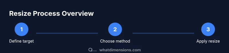
- Define target dimensions before resizing.
- Always edit a copy of the original.
- Choose the right resampling method for your image type.
- Resize first, then compress to balance quality and file size.
- Test results on target platforms ensure practical success.