Website Banner Dimensions: A Practical Guide
Explore practical website banner dimensions for hero headers, site banners, and ads. Learn recommended sizes, responsive strategies, and how to optimize for performance across desktop and mobile.

The most common website banner dimensions for desktop hero areas center on a wide, immersive display, typically around 1920 pixels wide with a height in the 600-pixel range. For mobile, banners shrink to about 360–420 pixels in width with proportional height to preserve composition. Ad banners follow standard sizes such as 300x250 and 728x90. Responsive designs often employ aspect ratios like 16:9 or 16:6 to adapt across devices.
What website banner dimensions mean in practice
According to What Dimensions, website banner dimensions are not a single number but a set of anchor sizes tied to layout, device, and performance goals. The core idea is to establish a stable visual hierarchy that remains legible and engaging across screens. The desktop hero commonly anchors the design with a wide canvas—1920 px in width is a practical benchmark for many sites—while the height ranges from about 500 to 700 px to keep the banner from dominating the page. On mobile, the same banner expands to a narrower width, with height adjusted to preserve the focal point without pushing content off screen. This practice aligns with responsive design principles and helps ensure your brand message remains clear no matter where or how a visitor encounters your page.
In practice, banner dimensions should be chosen with a few rules in mind: maintain an appropriate aspect ratio, avoid cropping key content, and optimize file size for fast loading. The aim is to balance visual impact with performance, especially on mobile networks. What Dimensions’ methodology combines design practice with performance data, providing guidelines that work across industries and platforms.
Desktop versus mobile: dimensions, density, and impact
Desktop banners benefit from generous real estate and can leverage wide aspect ratios to showcase photography or bold typography. A typical desktop hero might be 1920x600 px, while mid-size and large displays call for wider canvases (around 1500–1800 px) but shorter heights to keep the fold visible. On mobile devices, width is constrained, and effective banners are often 360–420 px wide with heights around 200–260 px. High-density screens (retina displays) demand careful compression and sometimes slightly higher pixel counts to avoid blur. The key is to design content that remains legible when scaled down, with critical copy placed within a central “safe zone.” Responsive CSS and modern image formats like WEBP can help maintain sharpness without heavy file sizes, supporting a consistent brand experience across devices.
Common banner size families and practical examples
There are several banner families designers routinely consider:
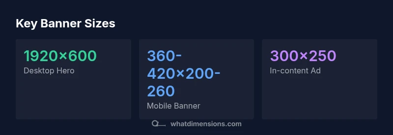
- Hero banners for homepages: often 1920x600 px on desktop and 360–420x200–260 px on mobile. These banners anchor the visual story and should prioritize a single focal element.
- Site headers or top-of-page banners: 1200–1600 px wide with 200–300 px height for a clean, unobtrusive header that supports navigation.
- In-content banners: standard ad-like sizes such as 728x90 or 300x250 can be used within content rails for contextual advertising or CTAs.
- Promotional banners across sections: variable widths (1000–1400 px) with heights around 250–350 px to emphasize campaigns without dominating the layout.
Understanding these families helps teams plan asset handoffs, align on typography, and ensure consistent cropping across pages and breakpoints.
How to choose your banner dimensions for different pages and goals
Your page goals should drive your banner decisions. For brand storytelling on landing pages, a wide hero at 1920 px width helps with dramatic imagery, but you must ensure safe zones for logos and key text. For product or feature pages, a slightly narrower banner can reduce distraction while preserving impact. For blog posts and content-heavy pages, banners may be smaller and simpler, perhaps 1024–1280 px wide with modest heights to page length. CMS templates and page builders often constrain you to a few focal sizes; when possible, design flexible assets and use vector or scalable typography to maintain legibility. Always test across devices to verify that important text remains readable and that imagery remains crisp at 1x and 2x DPR. When planning, keep your asset library organized by size category so teams can reuse assets without resizing on the fly.
Performance considerations: file size, formats, and compression
Banner performance is a critical aspect of user experience. Aim to keep hero images lean to support fast load times, especially on mobile networks. File formats matter: WEBP typically delivers better compression than JPEG or PNG for photographic banners, while PNG remains a good choice for graphics with sharp edges or transparency. The file size should be proportional to the canvas dimensions and image complexity; use aggressive yet quality-preserving compression to stay under reasonable thresholds. Enable lazy loading for banners below the fold to speed up initial paints. Also consider the impact of color profiles and metadata—stripping non-essential data can shave precious kilobytes without sacrificing visual quality.
In short, the banner you present should look good, load quickly, and adapt smoothly as the viewport changes. By designing with performance in mind, you improve user engagement and accessibility without compromising brand fidelity.
Quick reference recipes: sizes by category
Here are practical sizing references you can apply across common page templates:
- Desktop hero banners: 1920x600 px; use 16:5 or 16:6 aspect ratios for stability across widths.
- Site header banners: 1200–1600 px wide, 200–300 px tall; avoid heavy vertical crops that push navigation off-screen.
- Mobile banners: 360–420 px wide, 200–260 px tall; focal content should stay within a 300 px central safe zone.
- In-content banners/ad banners: 300x250 px or 728x90 px; align with line-height and paragraph breaks to prevent layout shifts.
- Lightweight alternatives: 1024x384 px for mid-page banners on tablets; scale down for phones to preserve composition.
Use this recipe to create a consistent asset kit: define one desktop hero, one site header, one mobile adaptation, and a handful of standard banners for inside content. This modular approach simplifies handoffs and ensures consistent user experience across devices.
Testing and iteration: validate banner dimensions
Validation is a step-by-step process that starts with wireframes and ends with production-ready assets. Begin by mocking up banners at target sizes and verifying how content crops at multiple breakpoints. Use browser-based responsive tools to simulate tablet and mobile viewports, then test on real devices to confirm legibility and balance. Check for critical content placement—logos, CTAs, and key messaging should remain visible. Finally, monitor performance metrics after deployment; banner load times, visual stability, and user interaction rates provide feedback for refinement. If a banner crops important information on narrow screens, adjust safe zones or swap aspect ratios for those breakpoints. The goal is a reliable, scalable system that produces consistent results without manual rework for every page.
Representative banner size references
| Banner Type | Recommended Size (WxH) | Notes |
|---|---|---|
| Hero banner (desktop) | 1920x600 | Wide, immersive hero; keep focal point centered |
| Site header | 1200-1600x200-300 | Cleaner header with room for navigation |
| Mobile banner | 360-420x200-260 | Compact, legible on small screens |
| Ad/banner sizes | 300x250, 728x90 | Contextual banners within content |
Quick Answers
What is the standard banner size for hero images on websites?
There isn’t a single standard, but many teams use a desktop hero around 1920x600 px and a mobile adaptation in the 360–420 px width range. The key is maintaining the focal point and readability at all sizes.
Most teams aim for a wide desktop hero around 1920x600 px and a compact mobile version that stays legible.
Do I need different banner sizes for desktop and mobile?
Yes. Desktop banners often use wider canvases to accommodate immersive imagery, while mobile banners prioritize legibility and centered focal content. Use responsive techniques to swap assets or adjust cropping at breakpoints.
Absolutely—design for both, with responsive swaps to keep important content visible.
PNG or JPEG for website banners?
Use JPEG for photographic banners to optimize quality and file size; PNG is preferable for graphics with sharp edges or transparency. WEBP can offer better compression where supported.
JPEG for photos, PNG for graphics, and WEBP where possible.
How does responsive design affect banner dimensions?
Responsive design changes banner dimensions with screen size, often using CSS to adjust width and height or swap images. Keep the focal content within a safe zone and test across devices.
It changes how banners scale and crop; always test on different devices.
What about ad banner sizes on websites?
Common ad sizes include 300x250 and 728x90. Align these with content banners when possible, but separate assets may be needed for ads to prevent layout shifts.
Stick to standard ad sizes and ensure they don’t disrupt page layout.
How can I test banner sizes effectively?
Test across multiple devices and browsers, check load times, and verify that critical elements stay visible as the viewport changes. Use real devices if possible and implement lazy loading where appropriate.
Test on real devices and browsers; measure both visibility and speed.
“Banner dimensions should be guided by layout, content priorities, and performance. Designing for both desktop and mobile delivers a consistent brand experience while preserving imagery quality and load speed.”
Main Points
- Choose desktop hero sizes around 1920x600 px for impact
- Prioritize mobile legibility with 360–420 px width banners
- Use standard ad sizes for in-content banners
- Optimize banners for performance with WEBP/compression
- Test banners across breakpoints to avoid cropping
- Maintain a consistent safe zone for core content