Dimensions 800 x 400 Pixels: A Practical Guide for Web and Print
Learn how dimensions 800 x 400 pixels apply to web banners and print headers. This guide covers aspect ratio, typical uses, optimization, accessibility, and cross-device consistency.
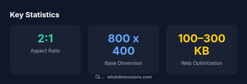
Dimensions 800 x 400 pixels describe a banner-style image that is 800 pixels wide and 400 pixels tall, creating a 2:1 aspect ratio. This size is widely used for hero images, headers, and thumbnails because it stays legible across devices, loads quickly, and fits most CMS blocks. Design with responsive scaling, consider DPR, and optimize compression to preserve clarity on screens of all sizes.
Understanding the 800 x 400 pixel dimension in practice
When designers refer to dimensions 800 x 400 pixels, they mean a fixed width of 800 pixels and a fixed height of 400 pixels. This creates a 2:1 aspect ratio that remains recognizable across displays. The phrase dimensions 800 x 400 pixels is commonly used for hero banners, site headers, and promotional tiles. On modern displays, the pixel grid maps to physical screen pixels, so scaling up or down affects sharpness but preserves the ratio. In web contexts, this size serves as a reliable baseline for layouts that require ample horizontal space for text and visuals while avoiding overly heavy graphics. When planning a page, consider how the 800 x 400 px frame interacts with surrounding content, margins, and typography to maintain visual balance.
Practical uses and layout considerations
A baseline like 800 x 400 px is versatile for hero images, headers, and two-column banners. Because of its 2:1 ratio, it scales well for wide screens but requires careful cropping on smaller devices. Use CSS to constrain the container width and let the image height auto-adjust. In responsive designs, provide a srcset with 800x400, 1600x800, and smaller alternatives, so browsers pick the best version. Keep important content inside a 'safe zone' away from edges; overlays or text must stay legible across devices. When possible, align the visual with your branding guidelines so that the 800 x 400 px frame feels intentional rather than generic.
Image optimization and performance
Performance matters for banners. The 800 x 400 px size is large enough to look sharp but small enough to load quickly when compressed properly. Choose WebP or JPEG as primary formats; PNG is acceptable for transparency or simple graphics. Target a web-optimized file size in the 100–300 KB range for typical photography; reduce further for dense pages or slower networks. Use progressive JPEGs where available, and compress with perceptual quality settings that preserve detail in areas with text. Leverage lazy loading for off-screen banners to improve perceived speed.
Accessibility, typography, and branding alignment
Accessibility enhances every visual decision. Provide descriptive alt text that conveys the image purpose, not just its dimensions. Ensure color contrast for any overlaid text and avoid relying on color alone to convey meaning. If you overlay typography on the 800 x 400 px image, use a subtle dark or light overlay to improve readability. Align the imagery with your brand's typography, color palette, and spacing tokens so that banners feel cohesive within the layout. Finally, consider alternate versions for embossing or subtle motion to satisfy accessibility and performance goals.
Comparison of image sizes and their typical uses
| Dimension | Aspect Ratio | Common Uses |
|---|---|---|
| 800 x 400 px | 2:1 | Hero banners; site headers; promo tiles |
| 1024 x 512 px | 2:1 | Large hero areas; wide headers; social previews |
| 600 x 400 px | 3:2 | Product thumbnails; inline imagery |
Quick Answers
What is the recommended file size for 800 x 400 images?
There isn’t a universal value. Aim for the smallest possible file size without visible quality loss, typically under a few hundred kilobytes depending on content and format. Use compression and modern formats like WebP when supported.
Aim for under a few hundred kilobytes, and test on devices for quality.
Can I use 800 x 400 px for social media banners?
Yes, but many platforms crop or resize images. Check platform guidelines and provide a safe margin to avoid important content being cut off.
Yes, but watch for cropping on social platforms.
How does 800 x 400 relate to responsive design?
The size is a fixed dimension; use responsive techniques like srcset, CSS max-width, and container queries to adapt across devices while preserving the aspect ratio.
It's fixed, so use responsive techniques to adapt.
What formats are best for this size?
WebP provides good quality at smaller sizes; JPEG is common for photos; PNG is preferred when transparency is needed. Choose based on content and browser support.
WebP or JPEG often work best; PNG if transparency needed.
What’s the difference between 800 x 400 and larger 2:1 sizes?
Larger 2:1 sizes like 1024 x 512 keep the same aspect ratio but offer more detail. Use them when your layout has extra horizontal space.
Larger 2:1 sizes offer more detail but need more bandwidth.
How can I ensure readability when overlaying text?
Use high-contrast text, consider overlay shading, and keep essential text out of image edges. Test on accessibility tools.
Ensure contrast and legibility with overlays.
“800 x 400 px assets establish a reliable baseline for cross-device visuals, balancing impact with performance across devices.”
Main Points
- Use 800 x 400 px as a baseline for banners and headers
- Keep content within a safe zone to avoid cropping
- Optimize file size to improve page load times
- Test across devices to ensure readability and balance