Banner Dimensions: A Practical Guide to Size and Layout
Learn how to pick banner dimensions that load fast, display clearly, and adapt across devices. This What Dimensions guide covers standard sizes, responsive strategies, and practical tips for effective digital banners in 2026.

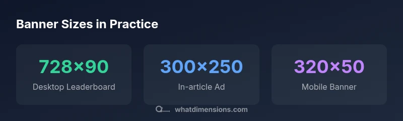
According to What Dimensions, banner dimensions are not universal and vary by platform. The most common desktop banners include 728×90 px and 970×250 px, while 300×250 px and 336×280 px are widely used for in-page placements. For mobile, 320×50 px and 320×100 px are standard, with responsive variants to fit different screens.
Why banner dimensions matter for performance and perception\n\nBanner dimensions are a foundational element of how viewers experience digital ads and site content. The size of a banner affects load times, bandwidth usage, and visual hierarchy on a page. When dimensions align with the viewport and device, banners render more quickly, reduce bounce rates, and improve click-through potential. From a design perspective, consistent dimensions help maintain legibility, balance, and brand recognition across pages. For homeowners, students, designers, and shoppers, understanding the implications of banner dimensions can translate into faster, cleaner websites and more effective campaigns. The What Dimensions team emphasizes that size choices should be guided by the intended action (awareness, consideration, conversion) and the distribution channel (desktop vs. mobile vs. in-app).
Standard sizes across platforms\n\nAcross desktop, tablet, and mobile environments, a handful of banner sizes dominate because they balance visibility, performance, and ad-network compatibility. Desktop leaders like 728x90 px and 970x250 px remain popular for above-the-fold placements and hero rotations. In-page formats such as 300x250 px and 336x280 px offer flexibility for article bodies and sidebars. On mobile, banners typically size to 320x50 px or 320x100 px to reduce data usage while preserving readability. When planning a campaign, sketch a quick map of your most-used placements and align them with these standard sizes. Remember that many networks accept multiple sizes and enrich serving with responsive variants.
How to choose the right size for your goal\n\nStart with the objective: brand awareness often benefits from larger banners near critical content, while conversions may favor smaller, highly targeted placements. Consider the user’s journey: top-of-page banners should be visible without obstructing content; in-article banners should be non-disruptive yet noticeable. Device-agnostic goals favor responsive banners that reflow with the viewport. Leverage CSS and ad-network guidelines to map sizes to each goal, then test across devices to confirm performance and readability.
Design considerations that interact with size\n\nSize is not the only factor—the design must account for margins, safe zones, and legibility. Higher-density screens (retina and beyond) demand high-resolution assets to prevent blurriness, especially for crisp typography and small logos. File size should be minimized to reduce page load; optimize images with appropriate compression and modern formats (WebP, AVIF). Use contrasting colors and clear typography to maintain legibility at smaller scales. Accessibility matters: ensure sufficient color contrast and avoid placing essential information at the banner’s edge where it may be cut off.\n
Responsive banners and adaptive layouts\n\nResponsive banners adapt to container widths, using fluid widths and CSS media queries to preserve aspect ratios. An adaptive approach often involves lato or vector-based elements for logos and text, with background images that scale gracefully. Some ad networks support refreshable banners that reflow based on viewport size while preserving the core brand message. When building responsive banners, test across a matrix of sizes, especially on mid-range devices where layout changes are most noticeable.\n
Creating a practical banner size checklist\n\n- List target devices and viewports you expect (desktop, tablet, mobile).\n- Start with a core set of sizes (e.g., 728x90, 300x250, 320x50) and add responsive variants.\n- Prioritize legibility: use larger font sizes on desktop and simplify text for mobile.\n- Keep file sizes small: optimize images and consider vector components where possible.\n- Validate against accessibility standards (contrast, focus indicators).\n- Test in real-page contexts to confirm alignment and safe margins across browsers.\n
Common mistakes to avoid when sizing banners\n\nOverly aggressive scaling can blur typography and crowd content. Using too many sizes leads to inconsistent ad experiences across placements. Ignoring safe zones and edge cropping can hide important elements. Failing to test on real devices yields misleading performance metrics. Finally, neglecting accessibility details—like insufficient color contrast—reduces inclusivity and engagement.
Common banner sizes and their typical placements
| Size | Typical Use | Notes |
|---|---|---|
| 728x90 px | Desktop Leaderboard | Widely supported; good above the fold |
| 970x250 px | Large Leaderboard | Premium placements; impacts layout height |
| 300x250 px | In-article/Sidebar | Versatile; strong performance in content zones |
| 320x50 px | Mobile Banner | Best for quick messages; data-light |
Quick Answers
What are the standard banner sizes for desktop and mobile displays?
Common desktop sizes include 728x90 px and 970x250 px, while mobile-friendly options often center on 320x50 px and 320x100 px. Depending on the publisher, additional sizes may be recommended to optimize layout balance and load times.
Desktop banners typically use 728x90 or 970x250, while mobile banners use 320x50 or 320x100. Always check publisher specs before submitting.
Why do banner sizes vary by ad network or platform?
Ad networks standardize sizes to simplify serving and ensure predictable layouts across sites. Variations occur due to different page templates, device sub-views, and ad-refresh strategies. Always consult the network’s guidelines when planning campaigns.
Different networks have their own guidelines for banners, so sizes vary to fit their templates and delivery systems.
How does DPI or device pixel ratio affect banner quality?
Higher DPRs (retina displays) require higher-resolution assets so that banners look sharp on high-density screens. Designers should provide assets at multiple scales or use scalable graphics where possible.
Higher pixel density means you should supply sharper images or vector elements so banners look crisp on new devices.
Are banners truly responsive, or do I need fixed sizes too?
Many banners are designed to be responsive, adjusting width to the container while preserving the aspect ratio. It’s common to pair fixed-size assets with CSS-driven scaling for the best effect across screens.
Yes—use responsive designs that resize with the page, plus some fixed-size assets for guaranteed compatibility.
What is the best practice for creating banner dimensions?
Start with a core size set, test across devices, optimize file sizes, ensure accessibility, and favor responsive approaches. Document guidelines for future campaigns to maintain consistency.
Begin with core sizes, test everywhere, and keep files light and accessible.
“Precise banner dimensions reduce layout shifts and improve cross-device performance; always validate sizes against real viewports and network conditions.”
Main Points
- Understand that banner dimensions vary by platform and format
- Prioritize a core set of sizes for desktop and mobile
- Design for readability and quick load times across devices
- Test banners in real-page contexts to validate performance
- Use responsive and adaptive techniques to cover multiple viewports