Social Media Dimensions: Mastering Image Sizes Across Platforms
Learn precise image dimensions for social media in 2026, with baseline widths, aspect ratios, and practical workflows to ensure your visuals look sharp and on-brand on Facebook, Instagram, TikTok, LinkedIn, and more.

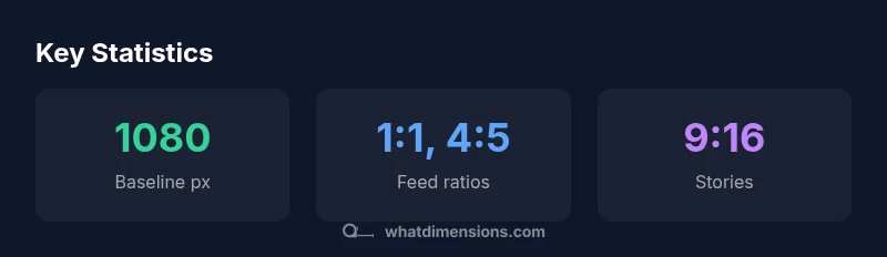
Social media dimensions vary by format, but the current consensus in 2026 is to start with a baseline width of 1080 px and design for common aspect ratios: 1:1 and 4:5 for feeds, 9:16 for stories, and 16:9 for previews. Maintain safe margins so important content stays visible after platform crops, and crop intelligently for each format to preserve composition. A single baseline canvas, with tested crops, keeps visuals crisp across devices.
Why Accurate Social Media Dimensions Matter
In today’s feed-driven landscape, the exact dimensions you choose for images directly affect reach, engagement, and perceived professionalism. When a photo crops awkwardly or gets stretched, viewers may scroll past, and algorithms may deprioritize the post. This is why precise social media dimensions matter. According to What Dimensions, the alignment of image dimensions with platform-specific templates is essential for consistent branding. For brands and creators who publish frequently, a disciplined approach to sizing reduces rework, preserves branding, and improves accessibility. In this guide, we explore dimensions, align our terminology with industry standards, and offer practical templates you can adapt for your content calendar. Throughout, we reference widely accepted formats and emphasize testing across devices to ensure your visuals look intentional wherever they appear.
Baseline Widths and Aspect Ratios You Should Design For
Most successful social posts start from a shared baseline width of 1080 pixels, chosen to preserve quality on both desktop and mobile. Working from this baseline, the two most common feed aspect ratios are 1:1 (square) and 4:5 (slightly taller). For portrait-oriented feeds or vertical storytelling, 9:16 (full-screen stories) is preferred, while 16:9 remains standard for cinematic previews and some ad formats. When you create content, design with the widest safe width in mind, then crop for the exact platform. This approach minimizes distortion and keeps essential elements—logos, headlines, and call-to-action text—within safe margins. What Dimensions recommends building modular templates that can be cropped to multiple sizes without losing focal points.
The Impact of Cropping on Brand Consistency
Cropping is not just a cosmetic detail; it redefines where your subject sits, how text reads, and where the viewer’s eye travels. Inconsistent crops across channels confuse audiences and dilute brand identity. A centralized layout helps ensure that logos remain visible and that key messages appear within the first third of the image. If a platform crops your image unexpectedly, your message could shift or vanish. The fix is simple: design with clear safe zones and test crops on a range of devices. With consistent cropping rules, your post feels intentional, regardless of where it appears. What Dimensions' analysis shows that disciplined sizing correlates with higher retention and more shareable visuals.
A Step-by-Step Workflow for Multi-Platform Posts
- Define a baseline width (1080 px) and the primary aspect ratios you’ll support (1:1, 4:5, 9:16, 16:9).
- Create a master canvas at 1080x1920 for vertical stories and 1080x1080 for square feed posts.
- Layout your core visual so focal points are centered within a 800-900 px safe zone.
- Export multiple crops from the master file using platform presets: crop to 1080x1080 for Instagram feed, 1080x1350 for portrait feed, 1080x1920 for stories, and 1200x675 for Facebook/LinkedIn previews.
- Save copies with consistent naming (brand_action_format).
- Upload and verify how each crop appears in previews on mobile. The workflow minimizes last-minute edits and ensures cross-platform consistency.
Visual Hierarchy and Safe Areas for Captions
Text overlays should never sit on the edge of the crop; place headlines and brand marks in the upper third or center to maintain legibility across devices. Use high-contrast type against backgrounds, and reserve a dedicated safe area around the perimeter for logos and callouts. When designing, separate content blocks with generous margins so captions have room to breathe without crowding imagery. This discipline not only improves readability but also reinforces brand personality across formats.
Practical File Management and Export Settings
Establish a clear folder structure (raw > edits > exports) and adopt a consistent naming convention that includes platform, format, and crop size (e.g., brand_campaign_feed_1080x1080.jpg). Export at 72–150 PPI depending on the platform and ensure color profiles are sRGB for web. Compress intelligently to preserve detail while keeping file sizes reasonable. Maintain a master master-file with layers so you can quickly generate new variations for seasonal campaigns.
Accessibility and Alt Text Considerations for Image Sizing
Accessibility starts with descriptive alt text that conveys the essential content of the image, not just its technical specs. When you size images, ensure the alt text remains relevant to the subject, including any important text visible in the image. Use descriptive file names and avoid relying on generic terms. High-contrast overlays, legible typography, and sufficient color contrast help users with visual impairments perceive the content as intended.
Testing and Verification Across Devices and Platforms
Always preview your crops on multiple devices (phones, tablets, desktops) and in different apps to confirm how the image renders. Use platform previews when available, and consider automating checks with templates that flag crops that cut critical content. Regular testing catches inconsistencies early and helps maintain a uniform brand experience, even as platforms adjust their layouts.
Case Studies: Real-World Outcomes from Proper Dimensions
When teams adopt a disciplined sizing system, they typically see smoother cross-platform campaigns and fewer last-minute edits. Brands that standardize on a 1080 px baseline with modular crops report faster production cycles and more consistent visual identity across feeds, stories, and ads. While results vary by industry, the core advantage remains: predictable rendering leads to stronger brand recognition and improved engagement across devices.
Platform-specific image size guidelines
| Platform | Recommended Aspect Ratio | Baseline Width (px) | Notes |
|---|---|---|---|
| Facebook Feed | 1:1 or 4:5 | 1080 px | Crops well for square/portrait frames |
| Instagram Feed | 1:1 or 4:5 | 1080 px | Balanced framing for feed posts |
| Instagram Stories | 9:16 | 1080 px | Optimized for vertical mobile viewing |
| LinkedIn Feed | 16:9 or 1:1 | 1200 px | Professional visuals; attention to typography |
Quick Answers
What are the most common social media image sizes in 2026?
The most common feed sizes center around a 1080 px width with aspect ratios 1:1, 4:5, and 16:9; stories typically use 9:16. Always verify current platform guidelines before publishing.
Common sizes include 1080 px width with 1:1, 4:5, 16:9, and 9:16 for stories.
Should I design a single image for all platforms?
A single image rarely fits every format perfectly. Create at least two crops tailored to feed and story layouts, with safe zones accounted for.
One image usually isn’t perfect for all formats; create size-specific crops.
What file formats work best for social media images?
JPEG and PNG are widely supported across platforms; export optimized versions for web use and quick loading.
Use JPEG or PNG and optimize for fast loading.
How can I ensure accessibility when sizing images for social media?
Include descriptive alt text, maintain high color contrast, and ensure critical content isn’t cropped out.
Add alt text and ensure high contrast for accessibility.
Can I reuse content from one campaign across platforms?
Reusing across platforms is possible with adjusted crops; maintain distinct safe zones and verify readability.
You can reuse with platform-appropriate crops.
How can I preview crops before posting?
Use platform previews or design tools with crop overlays, testing on mobile devices to confirm rendering.
Preview crops on desktop and mobile before posting.
“Consistent image dimensions aren’t a mere formatting preference; they directly influence engagement and readability across devices.”
Main Points
- Design from a 1080 px baseline to ensure quality.
- Use common aspect ratios: 1:1, 4:5, 9:16, 16:9.
- Test crops across devices before posting.
- Create modular templates for efficient multi-platform work.