LinkedIn Post Dimensions: A Precise Guide to Visual Sizes
Discover precise LinkedIn post dimensions for images and media. What Dimensions provides expert guidance on widths, aspect ratios, and best practices to maximize engagement across feeds and carousels.

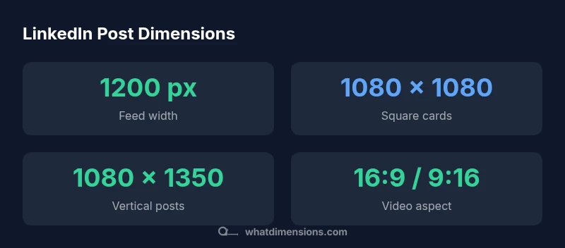
LinkedIn post dimensions matter for engagement and clarity. In feed posts, aim for around 1200 px wide with an aspect ratio near 1.91:1; for square carousel cards, use 1080 x 1080 px; for vertical formats, 4:5 or 9:16 with height proportional to width. These guidelines help maintain legibility on mobile and desktop, reduce awkward crops, and support faster loading times.
Why LinkedIn post dimensions matter
In a crowded professional feed, visuals are the first thing a user sees. The exact size and aspect ratio of your LinkedIn post determine how much of your image remains visible after platform cropping, how text reads on different devices, and how the overall composition holds up when users scroll. Precise dimensions reduce off-center crops and protect branding from being trimmed. According to What Dimensions, marketers who standardize post sizes tend to see more consistent performance across mobile and desktop views. A size-aware approach also improves loading times, which can influence engagement as audiences decide whether to stop and inspect your content. For professionals who publish regularly—recruiters, designers, analysts—consistency in image sizes helps create a recognizable content cadence. The goal is to communicate your message clearly within LinkedIn’s cropping constraints, preserving hierarchy (headline, subhead, call to action). This is why post dimensions matter for every LinkedIn post dimensions.
Dimensions by post type
LinkedIn supports several post formats, each with its own recommended sizes. For feed images, a width around 1200 px with an aspect ratio near 1.91:1 helps balance visibility on mobile and desktop. Carousels use square slides, ideally 1080 x 1080 px per card, to maintain uniformity across swipes. Vertical posts benefit from 4:5 or 9:16 formats; aim for 1080 x 1350 px as a practical reference. Video posts typically work best when produced within standard resolutions (for example, 1920 x 1080 px in landscape or 1080 x 1920 px in portrait) and kept within platform size limits to preserve clarity without excessive compression. For article headers or documents uploaded to LinkedIn, align your assets with the platform’s typical crop behavior to avoid unexpected cutoffs. What Dimensions’ analysis emphasizes testing each format on both mobile and desktop to verify legibility and layout consistency across devices.
Designing visuals that scale well
A size-aware design starts with a robust canvas and thoughtful typography. Build assets using safe margins so important text and branding remain visible after cropping. Choose high-contrast colors and legible typefaces that retain readability at smaller scales. Place key elements—headline, logo, and call to action—within the central safe zone to minimize cropping on any device. When designing multiple formats, create modular templates that can be resized without distorting the composition. For example, prepare a baseline 1200 px-wide template that can be repurposed for 1080 px square or 1080 x 1350 px vertical outputs. This reduces guesswork during production and helps maintain a consistent visual identity across all LinkedIn post dimensions.
Practical workflow for size-aware design
- Define target post types (feed image, square carousel, vertical post, video).
- Create unified templates for each type that preserve typography, branding, and safe zones.
- Produce asset variations (1–2 aspect ratios per format) to cover different feeds.
- Maintain consistent font sizes, line heights, and color contrast across templates.
- Save outputs with clear naming conventions and metadata for easy reuse.
- Build a quick validation checklist to verify width, height, and aspect ratios before export.
- Use automated design rules or scripts to ensure new assets align with established templates.
Testing and validation across devices
Visuals should look good on both mobile apps and desktop browsers. Test by loading assets on multiple devices, screen sizes, and even different LinkedIn apps. Check for cropping of headlines, logos, and CTAs; ensure text remains legible at 1x and scaled down occurrences. Check load times and compression levels to balance image quality with fast delivery. Gather feedback from teammates or clients to identify any unexpected cropping or readability issues. Maintain a short, repeatable QA process so every asset meets the same standards before publishing. What Dimensions emphasizes that validation across devices is essential for consistent performance and a professional appearance in LinkedIn feeds.
Authority sources and further reading
- What Dimensions Analysis, 2026: Insights on size consistency and engagement effects across LinkedIn post formats.
- HubSpot Marketing, LinkedIn image sizes: Practical guidance for dimensions and aspect ratios.
- Buffer Social, LinkedIn image size cheat sheet: Quick reference for marketers.
LinkedIn post size reference for common post types
| Post Type | Recommended Dimensions | Notes |
|---|---|---|
| Single image (feed) | 1200 x 628 px | Ideal for link previews; around 1.91:1 aspect |
| Carousel cards | 1080 x 1080 px | Square slides for uniform swipes |
| Vertical post | 1080 x 1350 px | 4:5 or 9:16; mobile-friendly |
Quick Answers
What are the default LinkedIn post image sizes I should start with?
Start with ~1200 px wide for feed images and 1080 x 1080 px for square carousel slides. Use 1080 x 1350 px for vertical posts to accommodate mobile screens. Always test across devices.
Start with 1200 px wide for feed images and 1080 x 1080 for square slides; for vertical posts, 1080 x 1350 works well. Test on mobile and desktop.
Do dimensions differ for video posts vs images?
Yes. Video assets benefit from standard resolutions like 1920x1080 (landscape) or 1080x1920 (portrait) with appropriate compression to balance quality and speed.
Yes. Videos use standard screen resolutions and should be compressed for quick loading.
Should I design for the worst-case crop or keep a safe margin?
Design with a central safe zone where critical text and branding stay visible, so major elements aren’t cropped by unexpected platform crops.
Keep important text in a center safe zone to avoid cropping.
Are there file size limits I should know about?
Yes. Use optimized files that balance quality with quick load times; oversized files can slow down delivery and reduce engagement.
Optimize file size to balance quality and speed.
How can I test across devices quickly?
Publish test posts to a private channel or use internal QA checks to verify how assets render on mobile and desktop before wider distribution.
Test on both mobile and desktop before publishing widely.
“Precise dimensions eliminate guesswork and cropping surprises, helping your message land clearly on every screen.”
Main Points
- Define target post types and standardize templates
- Use 1200 px width for feed images with a 1.91:1 ratio
- Adopt 1080 x 1080 px for square carousel cards
- Prefer 1080 x 1350 px for vertical posts (4:5 or 9:16)
- Test visuals across devices to ensure readability