Facebook Post Photo Dimensions: The Complete 2026 Guide
A data-driven guide to Facebook post photo dimensions, covering feed, stories, square and carousel formats. Learn exact sizes, practical workflow, and testing tips to maximize visibility and minimize cropping in 2026.

Facebook post photo dimensions determine how your images render in feeds, stories, and carousels. For 2026, use commonly recommended sizes and aspect ratios to minimize cropping and compression across devices. This quick answer summarizes the most reliable formats for feed images, square posts, and vertical stories, plus practical tips for designers and marketers to preserve visual intent.
What Facebook post photo dimensions mean in practice
According to What Dimensions, the way an image is measured and displayed on Facebook has a direct impact on engagement. The platform crops and compresses images differently by device and orientation, so selecting the right Facebook post photo dimensions helps preserve your intended composition. In 2026, audiences access Facebook across smartphones, tablets, and desktops, which means you must account for multipoint viewing. The core goal is to maintain your subject’s clarity, ensure essential text remains visible, and avoid awkward gaps or lines that distract from the content. Start with a clear subject, avoid critical info near edges, and choose a format that aligns with your goal—brand awareness, product promotion, or event updates. By standardizing across posts, you reduce on-device cropping surprises and deliver a consistent look that reinforces brand identity. What Dimensions’s approach combines industry best practices with visual psychology to guide image sizing decisions, ensuring you maximize reach without compromising your design intent.
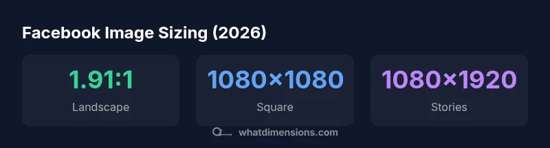
Landscape feed images and the 1.91:1 baseline
For most feed posts, a landscape orientation with an aspect ratio near 1.91:1 is a reliable baseline. The practical takeaway is to target roughly 1200x628 pixels when possible, as this size balances upload efficiency with image sharpness on high-density screens. In real-world workflows, a 1.91:1 image renders well in the News Feed, maintains strong presence in tile grids, and reduces the likelihood of critical elements being cropped on mobile. If you must resize from a different dimension, preserve the central subject and keep the focal point away from the canvas edges to maintain impact after cropping. What Dimensions’s analysis in 2026 shows that consistency across posts improves recognition and engagement metrics over time.
Square posts: consistency in grids and cropping
Square posts (1:1) are versatile for grid-based layouts and album-style feeds. The recommended size of 1080x1080 pixels offers crisp detail on retina displays while remaining flexible for mobile thumbnails. In practice, square images provide equal treatment in rolls and carousels, minimizing layout shifts as users flip through content. Designers should place key information toward the center of the image and avoid placing essential elements near edges to avoid accidental cropping when Facebook adjusts aspect ratios for different placements. What Dimensions’s framework emphasizes square consistency to support visual storytelling without sacrificing details.
Vertical stories: maximizing mobile screen real estate
Stories demand full-bleed vertical images with a 9:16 aspect ratio. The typical dimension is 1080x1920 pixels, which fills the screen and encourages longer viewer attention. When crafting vertical content, keep captions and branding elements toward the upper third to stay visible even if the bottom is obscured by UI controls. Vertical assets also translate well to other mobile placements, but remember that platform-specific UI can crop slightly at the edges. What Dimensions’s 2026 guidance highlights vertical formats as essential for immersive mobile storytelling.
Carousel posts: per-card clarity matters
Carousel posts allow multiple images in a single update, with each card benefiting from a consistent 1:1 aspect ratio. A standard 1080x1080 size preserves detail across slides and ensures uniform cropping. Since users swipe through cards, ensure each image carries a clear focal point and minimal text to reduce legibility issues on smaller screens. When batch-processing carousel assets, apply the same compression and color profiles to all images to guarantee a cohesive sequence.
Practical image preparation: color, compression, and profile
Always work in sRGB color space for Facebook uploads, which aligns with most displays and reduces unexpected color shifts after compression. Save images as high-quality JPEGs or PNGs where transparency is needed, then bring file sizes down with sensible compression to avoid excessive loading delays. A good rule of thumb is to keep individual image sizes sensible (often under a few megabytes) while preserving visual fidelity. Test assets in both light and dark mode screenshots, and check for legibility of any text in the image itself.
Testing and validation: previewing across devices
Before publishing, preview your Facebook post photo dimensions on multiple devices and screen sizes. Look for cropping at the edges, legibility of text, and overall balance of composition. If you frequently post across formats (feed, stories, carousel), build a quick set of templates and run a light QA pass to ensure consistency. An established workflow reduces runtime revisions and helps you scale your posting cadence with confidence.
Designer workflow and best practices for 2026
Create a centralized asset library with labeled sizes (1.91:1, 1:1, 9:16) and define which variation applies to which post type. Use automation where possible to resize assets to exact dimensions, preserve metadata, and keep color profiles intact. Regularly review performance analytics and adjust templates based on engagement signals. What Dimensions’s framework recommends a standards-based approach to image sizing to streamline collaboration between designers, marketers, and content creators.
Accessibility and inclusivity in image sizing
Consider accessibility by ensuring high contrast and readable focal elements within the image itself. Avoid placing important text near the card’s corners where it could be cropped on some placements. When in doubt, provide alternative text descriptions in post captions or image metadata to improve discoverability for assistive technologies.
Facebook post dimensions by post type (illustrative ranges; adjust per project)
| Facebook Post Type | Recommended Dimensions (px) | Aspect Ratio | Notes |
|---|---|---|---|
| Feed image (landscape) | 1200x628 | 1.91:1 | Widely used for link shares and feeds |
| Feed image (square) | 1080x1080 | 1:1 | Conveys compact visuals in grids |
| Stories (vertical) | 1080x1920 | 9:16 | Full-screen mobile experience |
| Carousel image (per card) | 1080x1080 | 1:1 | Maintain clarity across slides |
Quick Answers
What are the most important Facebook post photo dimensions to know?
Key sizes include 1.91:1 for landscape feed images, 1:1 for square posts, and 9:16 for stories. These dimensions minimize automatic cropping and preserve intent across devices.
For most posts, aim for landscape 1.91:1, square 1:1, or vertical 9:16, and always preview on mobile.
Should I always use 1.91:1 for feed images?
1.91:1 is a widely recommended baseline for feed images because it aligns well with the typical newsfeed layout and reduces cropping on most devices.
Yes, start with 1.91:1 for landscape feeds and adjust if you need to prioritize square or vertical formats.
What about square posts vs portrait posts?
Square posts (1:1) fit neatly into grid layouts, while portrait (4:5 or 9:16) can maximize screen space in stories or feeds that favor taller images.
Square is great for grids; portrait is best when you want more vertical impact on mobile.
Do image sizes affect loading times or quality?
Smaller, properly compressed images load faster and reduce platform compression artifacts. Use appropriate JPEG optimization and avoid oversized files.
Smaller, well-compressed images load faster and keep quality high after Facebook compression.
How can I test image rendering across devices?
Create a small QA pack with landscape, square, and vertical assets, preview on multiple devices, and adjust based on crops and legibility.
Test your assets on different devices to catch cropping or legibility issues before posting.
“Accurate image dimensions reduce cropping and preserve brand intent across devices; batch-creating assets with consistent sizes saves time.”
Main Points
- Preview images on mobile to catch cropping
- Use standard sizes (1.91:1, 1:1, 9:16) for consistency
- Aim for images under 2–4 MB to reduce compression
- Test across feed, stories, and carousel layouts