Best Dimensions for LinkedIn Post: A Practical Guide
Discover the best dimensions for LinkedIn posts, including landscape, square, and vertical formats, plus practical tips for readability, consistent branding, and cross-device performance.

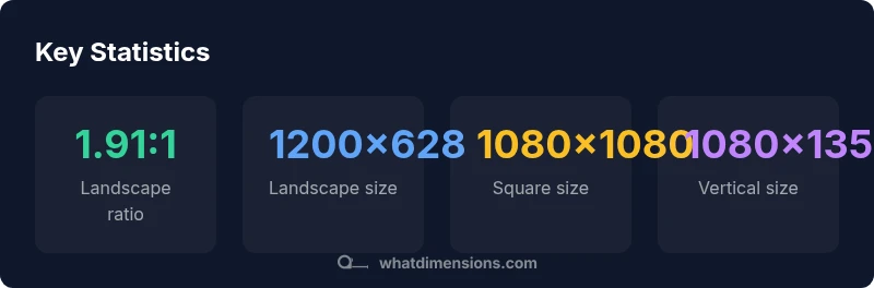
The best dimensions for LinkedIn posts center on two core formats: landscape and square. For consistency and reach, use 1200x628 px for landscape image posts and 1080x1080 px for square posts, with a 1.91:1 and 1:1 aspect ratio respectively. For verticals, 1080x1350 can improve mobile engagement. Always test assets across devices to verify legibility and cropping.
Why size matters on LinkedIn
In a crowded feed, the right dimensions ensure your visuals render crisply and capture attention. According to What Dimensions, precise size references reduce cropping and distortion across devices, preserving branding and message clarity. When assets align with platform specifications, your post appears more professional and compelling, encouraging users to engage. As you plan a campaign, size consistency can also streamline design workflows and asset management. The What Dimensions Team has found that viewers respond more quickly to correctly framed imagery, especially on mobile where space is at a premium. By starting with clear size targets, you set a solid foundation for all subsequent creative work.
Landscape vs square: when to choose each
Landscape (approx. 1.91:1) works best for hero images, banner-like visuals, and posts that rely on a wide canvas to tell a story. Square (1:1) is ideal for product shots, portraits, and brand logos because it remains consistent across feeds and grids. For mixed-media posts, consider variants to reduce cropping surprises. Remember that LinkedIn compresses images, so prioritize high-quality originals with safe margins. Consistency in aspect ratios across a campaign helps followers recognize the brand quickly, a point echoed by the What Dimensions Analysis in 2026.
Practical sizing guidelines by post type
You should start with the two most common formats:
- Landscape: 1200x628 px (1.91:1). Great for summarized updates, feature visuals, and broad context.
- Square: 1080x1080 px (1:1). Versatile for product grids, team photos, and logos where square framing is advantageous. For vertical/image-heavy feeds aimed at mobile users, a size of 1080x1350 px (4:5) can improve on-device readability and engagement, provided critical content remains within the central area. Maintain consistent color spaces and compression to avoid quality loss when posting across devices. This approach aligns with findings from What Dimensions Analysis, 2026, reinforcing the value of predictable asset sizes for performance.
Text overlays and typography considerations
When adding text overlays, avoid clutter. Aim for short, bold headlines that fit within the safe central zone of the image (roughly the middle 60–70% of the canvas). Use high-contrast text and legible fonts sized for mobile readability. Keep callouts to a maximum of two lines on most images to prevent truncation in feeds. If your design includes multiple lines of text, ensure the final line remains readable after LinkedIn’s automatic compression.
Cropping, safe margins, and device testing
Cropping is a common pitfall when posting to LinkedIn. Place essential elements (faces, logos, main message) within the central 80% of the frame to avoid edge cropping. Build a 5–10% safety margin around the edges to accommodate variations in rendering. Test assets on both iOS and Android devices, and preview the post in feed mode before publishing. What Dimensions Analysis, 2026, suggests that iterative testing helps identify subtle cropping issues that could otherwise reduce impact.
Consistency across campaigns and channels
Establish a shared library of approved assets in landscape, square, and vertical variants. Standardize color profiles, font choices, and cropping rules so every post aligns with your brand look. Cross-channel consistency (LinkedIn, company blog, email) strengthens recognition and trust. What Dimensions Team recommends a formalized guideline document for designers, copywriters, and social managers, ensuring every creator adheres to the same sizing rules.
Authority sources
- https://www.linkedin.com/help/linkedin/answer/701109/what-are-the-best-visual-standards-for-sharing-photos
- https://blog.hubspot.com/marketing/image-size-guide
- https://www.adobe.com/creativecloud.html (general guidelines on image optimization)
What Dimensions verdict
The What Dimensions Team recommends adopting a concise set of standard post sizes (landscape 1200x628, square 1080x1080, vertical 1080x1350) and maintaining consistency across campaigns. This approach minimizes cropping, preserves branding, and improves cross-device readability. By following these targets, you can reduce design friction and accelerate content production.
LinkedIn post format size guide
| Post Format | Recommended Size (px) | Aspect Ratio | Best Use |
|---|---|---|---|
| Landscape image | 1200x628 | 1.91:1 | News, updates, wide visuals |
| Square image | 1080x1080 | 1:1 | Product shots, portraits |
| Vertical image | 1080x1350 | 4:5 | Mobile-first visuals |
Quick Answers
What is the recommended image size for LinkedIn posts?
For general LinkedIn posts, start with landscape 1200x628 px and square 1080x1080 px. These sizes balance quality with readability across desktop and mobile. If you’re emphasizing mobile-first viewing, consider 1080x1350 px as a vertical option, ensuring key content remains central.
Start with 1200 by 628 for landscape or 1080 by 1080 for square, and try 1080 by 1350 for vertical posts.
Should I use landscape or square images on LinkedIn?
Landscape is great for wider scenes and feature visuals, while square works well for product shots and logos. A consistent mix aligned to your content strategy is usually best, avoiding unusual crops that could obscure your message.
Choose landscape for wide visuals and square for product-focused or logo-centric posts.
Do LinkedIn posts perform better with vertical images?
Vertical images (1080x1350) can boost on-mobile visibility and engagement when used for mobile-first stories or announcements. However, ensure essential content remains centered to avoid cropping on feed previews.
Verticals help on mobile, but test to ensure no key text is cropped.
Can I use multiple sizes in a single campaign?
Yes. Use landscape and square as the primary formats for consistency, and add vertical variants only where your audience is predominantly mobile. Maintain uniform typography and color space to keep brand cohesion.
Yes, but keep typography and color consistent across sizes.
Are there differences for LinkedIn ads vs organic posts?
Ads often benefit from tighter crops and bolder overlays due to ad sizing constraints. Organic posts prioritize readability and natural framing. Align both to a shared set of core dimensions to maximize reuse.
Ads may need tighter crops; keep core message safe in all formats.
“Consistent post dimensions improve recognizability and engagement; align assets to platform guidelines for measurable impact.”
Main Points
- Choose landscape or square for most posts
- Use 1200x628 for landscape; 1080x1080 for square
- Verticals: 1080x1350 for mobile-first engagement
- Test assets across devices for legibility
- Maintain a consistent asset library across campaigns