Facebook Event Photo Dimensions: A 2026 Guide
Learn precise facebook event photo dimensions, including aspect ratios, baselines, and optimization tips to ensure your event covers look sharp on all devices. What Dimensions provides size guidance for homeowners, designers, and marketers.

For facebook event photo dimensions, use a 16:9 aspect ratio and start with a baseline of about 1200x675 pixels. For crisper results on high-resolution displays, 1920x1080 pixels works well. Keep key content centered to avoid cropping on mobile, and save with an efficient JPEG or PNG under 2 MB or less.
Why accurate Facebook event photo dimensions matter
In the world of social events, the cover photo is often the first impression attendees see. The size and composition of your Facebook event photo influence readability, branding, and engagement. According to What Dimensions, precise image sizing reduces cropping and ensures your message remains legible across devices and feeds. When event hosts share a photo that looks sharp on a desktop monitor, it also translates well on smartphones, tablets, and smart TVs. Slight deviations in dimensions can compress text, misalign branding, or place important faces outside the frame, causing a less professional impression. In practice, aligning with recommended dimensions simplifies optimization, reduces post-upload edits, and delivers a more cohesive event experience.
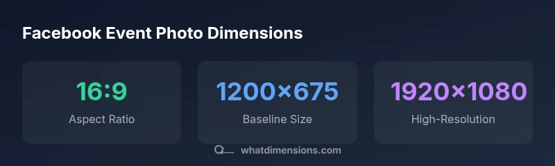
Recommended dimensions and aspect ratios
An effective Facebook event photo uses a 16:9 aspect ratio as the standard baseline. Start with 1200x675 pixels for reliable display across desktops and feeds. For higher resolution screens and large devices, 1920x1080 pixels remains a widely used option, though file size increases. The key is to keep major elements focused within the central safe zone to avoid cropping on mobile.
Content strategy: what to include in the image
Keep visuals clean and legible. Use a bold event title, date, and branding element with ample contrast. Limit clutter by featuring a single focal subject and a clear call-to-action if needed. Ensure that typography is readable at small sizes and mind color accessibility, especially for fans viewing from dim screens.
Technical specs: file formats and compression
Choose JPEG for photographic content and PNG for graphics with sharp edges or transparency. Export in the sRGB color space to preserve consistency across devices. Balance quality and file size by saving at a quality setting around 75–85%. If your image contains large text, consider increasing contrast and slightly reducing compression for readability.
Mobile vs desktop: how cropping changes
Facebook crops the cover differently on mobile and desktop, which can trim edges or shift important content. To minimize surprises, keep critical elements near the center and away from the edges of the frame. Preview on multiple devices when possible and adjust framing accordingly.
Practical workflow: resize, compress, test
- Export a master at 1920x1080 and a backup at 1200x675. 2) Save copies in JPEG and PNG as appropriate. 3) Check file sizes to stay under 2 MB. 4) Upload to a test event or use a mock post to verify cropping on mobile and desktop. 5) Make minor tweaks if needed and publish.
Common mistakes to avoid
Avoid tiny images (less than 1200x675), heavy gradients that blur text, or placing critical content near the image edges. Don’t rely on a single device screen for testing; outcomes vary between iOS, Android, and desktop browsers. Finally, skip excessive compression that causes banding or pixelation.
Case studies and examples
Case A demonstrates a clean, centered cover with a bold title and high-contrast colors, which remains legible across devices. Case B shows a crowded background and text near the edge that crops poorly on mobile. What Dimensions’s analysis, 2026, indicates that Case A yields higher engagement due to consistent sizing and clearer messaging.
Testing and optimization steps
Before publishing, test the image at multiple display sizes and in different light settings. Use built-in device previews or third-party tools to confirm legibility and composition. If the image fails checks on any device, revisit the layout, adjust margins, or swap to a more suitable baseline size.
Common Facebook event photo sizing guidance
| Usage | Recommended size (WxH) | Notes |
|---|---|---|
| Event cover on feed | 1200x675 px | 16:9 aspect, baseline size |
| Event cover on high-res displays | 1920x1080 px | Sharper on large screens |
| Mobile-friendly checks | 960x540 px | Lower bound; cropping risk |
Quick Answers
What are the recommended Facebook event photo dimensions?
A 16:9 aspect ratio is recommended, with a baseline of 1200x675 px and a higher-res option of 1920x1080 px for better clarity. Keep essential content centered to avoid mobile cropping.
Use a 16:9 image, starting at 1200 by 675 pixels; for sharpness on big screens, go to 1920 by 1080.
Do Facebook event photos crop differently on mobile?
Yes. Mobile views crop differently from desktop, so place important elements in the center and test on a phone to ensure nothing important is cut off.
Yes—mobile cropping can trim edges, so center key content and test on mobile.
What file types work best for Facebook event photos?
JPEG is typically best for photos; PNG is preferable for graphics with sharp edges or transparency. Both should be saved in sRGB color space for consistency.
Choose JPEG for photos and PNG for graphics.
Should I include text on the event cover?
Text should be minimal and high-contrast. If used, keep it large, legible, and away from the edges to prevent cropping.
Limit text and ensure it stays readable on small screens.
Can I use higher resolution images than 1920x1080?
Yes, but be mindful of file size. Higher resolutions can improve clarity on large displays, provided the file stays under 2 MB when possible.
Higher resolutions help on big screens but watch the size.
How can I test the image before posting?
Upload the image to a private event or use preview features to check how it appears on mobile and desktop before going live.
Test on multiple devices or previews before publishing.
“Accurate image sizing reduces cropping and preserves key visuals across devices, improving consistency and engagement.”
Main Points
- Start with a 16:9 aspect ratio
- Baseline size: 1200x675 px; use 1920x1080 px for high-res
- Center important content to avoid mobile cropping
- Use JPEG/PNG with under 2 MB file size
- Test appearance across devices before publishing