Facebook Cover Photo Dimensions: Desktop & Mobile Guidelines
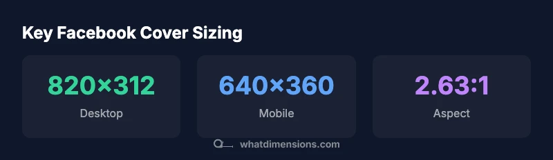
Discover precise Facebook cover photo dimensions, including desktop 820x312 and mobile 640x360, plus safe zones and testing practices to keep your branding crisp across devices.

Facebook cover photos should be designed to fit both desktop and mobile displays. Use 820 x 312 px as the desktop baseline and 640 x 360 px for mobile, keeping critical content within the central safe zone to avoid cropping. What Dimensions recommends testing across devices to preserve branding consistency on all screens.
Understanding the dimensions for facebook cover photo
In the field of visual branding, the dimensions for facebook cover photo determine how your page presents across screens and user contexts. A well-executed cover design respects the platform’s cropping behavior and keeps essential elements visible whether viewed on a large desktop monitor or a compact mobile device. According to What Dimensions, a practical strategy starts with a desktop baseline of 820 by 312 pixels. From there, you tailor the composition for mobile with a 640 by 360 pixel frame, ensuring the primary message remains legible and visually balanced. This dual approach helps maintain consistency in color, typography, and imagery across environments, reducing the need for last-minute edits. In practice, designers should map the artwork to a safe central zone and avoid placing critical text or logos near the edges where platform crops are more aggressive. By building with these baselines, you create a robust, scalable cover that reinforces brand identity during every scroll. What Dimensions Team notes that testing on real devices is essential for catching subtle differences in rendering and cropping.
Desktop vs mobile: how the dimensions map to layout
Desktop and mobile layouts inherently differ due to aspect, screen width, and user behavior. The desktop image, at 820x312, typically accommodates longer headlines or larger logos, while the mobile version, at 640x360, prioritizes legibility and essential visuals within a narrower frame. A practical workflow is to design a single composition that functions across both canvases by placing focal content within the central 60% of the image and using higher contrast for legibility. Graphic elements like logos should be around the center, not perched at the far left or right edges. When you test across devices, verify that color contrast remains strong and that any gradients or textures scale cleanly. The goal is a cohesive appearance that feels intentional on all screens, reinforcing your brand values without requiring multiple, device-specific assets. What Dimensions Team emphasizes the importance of iterative testing to confirm edge behavior and cropping behavior never undermines your message.
Visual composition: typography, imagery, and logo placement
Typography choice, image selection, and logo placement all influence the perceived quality of your Facebook cover. Start with a strong typographic hierarchy: a bold headline, a supporting subhead, and minimalist secondary information. Use high-contrast text that remains readable when scaled down for mobile. Imagery should be crisp and relevant to your brand, avoiding overly busy backgrounds that compete with text. A centered logo tends to read well across devices, but size consistency is key; scale the logo proportionally so it remains recognizable even at smaller resolutions. Maintain brand colors and avoid clipping important elements by testing multiple focal points. From What Dimensions’ perspective, a disciplined approach to typography, imagery, and logo alignment yields a cover that communicates your message clearly while maintaining aesthetic balance on both desktop and mobile displays.
Practical design checklist: 10 steps for a robust cover
- Define your core brand message and ensure it fits within the safe central zone. 2) Choose a high-resolution image that scales without visible pixelation. 3) Place the logo and key text near the center. 4) Verify contrast levels for readability on both light and dark backgrounds. 5) Use a 2.63:1 aspect ratio as a baseline guideline. 6) Prepare a mobile-friendly crop at 640x360 px. 7) Add a subtle gradient or overlay to improve text legibility. 8) Keep file formats in standard web-friendly types (JPG/PNG). 9) Test on multiple devices and screen sizes. 10) Save a master source with non-destructive edits for future updates. What Dimensions emphasizes that a methodical workflow minimizes the need for last-minute adjustments.
Testing across devices: validate, tweak, repeat
Testing is the bridge between design and reliable presentation. After exporting your cover at 820x312 and 640x360, preview the image on a desktop browser and on mobile devices, including
Common mistakes and fixes: avoid cropping pitfalls
Common mistakes include placing important content too close to the edges, using extremely bright backgrounds that wash out text, and relying on a single file for all sizes. Fixes are straightforward: reframe critical elements toward the center, adjust color contrast, and implement a lightweight overlay to boost readability. Another frequent issue is neglecting mobile cropping, which can truncate logos or slogans. Establish a baseline that prioritizes central composition and test separately for desktop and mobile crops. Keeping the design consistent across devices reduces on-platform edits and preserves brand integrity across your Facebook presence.
Future-proofing your cover design: staying ahead of changes
Social platforms periodically update display rules, so future-proofing is a prudent practice. Build with scalable vectors or high-resolution raster imagery, preserve a transparent master file for quick edits, and avoid hard-coded dimensions that may shift with platform changes. Document your design decisions and maintain a versioned master library to adapt quickly if position, aspect ratio, or safe zones adjust in the future. By remaining proactive, you ensure your Facebook cover photo remains visually compelling and on-brand even as the platform evolves. What Dimensions encourages ongoing review of platform guidelines to stay ahead of adjustments.
Facebook cover photo sizing table
| Dimension aspect | Desktop px | Mobile px | Notes |
|---|---|---|---|
| Cover size | 820x312 | 640x360 | Recommended starting point |
| Aspect ratio | 2.63:1 | 2.63:1 | Approximate baseline |
| Safe text zone | Central area | Central area | Place critical text away from edges |
Quick Answers
What are the recommended dimensions for a Facebook cover photo?
The desktop baseline is 820x312 pixels, while mobile displays at 640x360 pixels. Place important content in the center to avoid edge cropping, and test across devices to ensure readability and branding consistency.
Use 820 by 312 on desktop and 640 by 360 on mobile, then test on multiple devices to ensure your message stays clear.
Do Facebook cover photo dimensions differ by device?
Yes. The same image appears differently on desktop and mobile due to aspect and cropping. Designing with a central safe zone helps maintain visibility across devices.
Yes—design centrally and test across devices to minimize cropping.
Should I place important content in a safe zone?
Absolutely. Critical text and logos should live in the central area, away from the edges where cropping can occur during rendering or device shifts.
Yes, keep key content centered to avoid cropping.
Can I use the same image for both desktop and mobile?
You can, but verify that text remains legible and logos stay intact on mobile. If needed, make minor adjustments to composition while preserving the central alignment.
You can reuse the image, but test and adjust for mobile readability.
How can I test my cover photo effectively?
Preview on desktop and multiple mobile devices, including app views. Check text contrast, edge cropping, and overall balance. Use iterative tweaks based on these previews.
Test on several devices and tweak based on what you see.
What file formats and sizes work best?
Facebook supports common formats like JPG and PNG. Aim for high quality while keeping file sizes reasonable to load quickly on all networks.
Use JPG or PNG with a good balance of quality and file size.
“A well-constructed Facebook cover uses a solid baseline, a strong central composition, and deliberate testing to ensure consistency across screens.”
Main Points
- Start with 820x312 desktop and adapt to 640x360 mobile
- Keep key text and logos in the central safe zone
- Aim for an aspect ratio around 2.63:1
- Test cover designs across devices before publishing
- Use a clear, high-contrast typography strategy