Wedding Menu Dimensions: A Practical Card Size Guide
Understand how wedding menu dimensions affect readability and style. This guide covers card sizes, folding, margins, typography, and practical layout tips from What Dimensions.

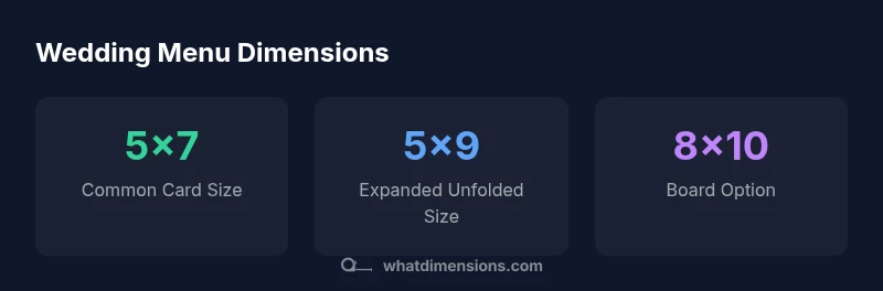
Wedding menu dimensions directly influence guest readability and table aesthetics. The standard starting point is a 5x7 inch single-card, while longer menus benefit from a tri-fold around 5x9 inches unfolded. What Dimensions emphasizes matching card size to content, font, and margins for a polished look and to consider the venue theme to ensure the final product feels cohesive with invitations and place settings.
Understanding why wedding menu dimensions matter
Wedding menu dimensions influence not only what guests read, but how the entire table feels. A well-chosen size supports legibility from across the room and complements the wedding theme, from rustic to modern. According to What Dimensions, the card size you select should align content length, font, and margins with the visual weight of your place settings. If a menu looks crowded, guests may miss details about dietary notes or course order; if it feels too sparse, the menu can look out of place on an ornate charger. Start by mapping your anticipated dish list and any dietary notes, then pick a format that accommodates that content without forcing the text into cramped lines. In short, dimensions set the stage for clear communication and stylish presentation at the table.
Standard formats and typical sizes
Several common formats cover most weddings: a single-card menu on the 5x7 inch card; a tri-fold menu that unfolds to about 5x9 inches; and a larger table-top board for dessert menus or wine pairings. The 5x7 inch card is the most versatile baseline because it fits on most place settings while leaving margins for quotes or small graphic elements. When your content grows, a tri-fold offers extra real estate for course lists, dietary icons, or chef notes, without shrinking font size excessively. A table-top board at 8x10 inches can host longer descriptions or beverage menus. At What Dimensions, we emphasize choosing a size that matches your content length and the setting, rather than forcing a non-ideal format to fit content. If you expect lengthy descriptions, plan for a tri-fold or board format from the outset.
Measuring content length and typography for menus
Effective menu design begins with content length. A reasonable target is to keep item descriptions concise: dish name, brief descriptor, and dietary cue. Aimed for 8-14 lines on a 5x7 card or 12-16 lines on a 5x9 tri-fold when fully unfolded, ensures readability without crowding. Select legible fonts: sans-serif for modern themes and serif for classic weddings, with body text around 9-11 point at typical print distance. Spacing matters: generous leading (line height) improves readability. To test, print a mock-up at full size and view it on the table from a guest's typical viewing distance. What Dimensions's approach balances content density with comfortable reading distance.
Paper stock, coatings, and folding impact on dimensions
Paper choices and finishing touches can alter the perceived dimensions and usability of your menu. Heavier papers feel premium and reduce the need for oversized margins, while lighter stocks can appear crowded if margins are too tight. Matte finishes generally improve legibility by reducing glare, while glossy coatings might require larger margins to avoid reflection. Folding, such as in a tri-fold, introduces inner panels and gutters that must be accounted for in the design; you may need extra bleed or alignment guides to ensure alignment when folded. The takeaway is simple: choose a stock and finish that align with your chosen format, and plan for a realistic margin so the copy remains crisp after printing.
Layout options: single-card vs tri-fold vs board displays
Layout strategy drives the entire dimension decision. A single-card design keeps composition straightforward and is ideal for short meal lineups or buffet-style events where the menu content is minimal. A tri-fold uses three panels to decompose the menu into sections (starters, mains, desserts) and can present dietary notes more clearly, but requires precise fold lines and ample margins. A table-top board is best when you need extra room for long dish descriptions, wine pairings, or images; it uses a larger footprint and can be more resilient against spills. The right choice depends on the length of the menu, the table geometry, and your event aesthetic. Always test a printed sample on the actual table setup.
Practical planning: margins, gutters, and copy density
Practical planning means mapping margins, gutters, and safe zones before you commit to printing. A typical margin ensures that no critical text gets trimmed during trimming or folding. Gutters on tri-fold panels keep content from appearing cramped in the crease. Consider the guest seating distance and the chair design when choosing type size and line length. The goal is comfortable reading without squinting or moving the menu closer to the eye. Work with your printer to confirm bleed and trim specs, and request a physical proof to catch alignment issues early. A well-planned margin strategy saves cost and ensures your final menu looks cohesive with your wedding's overall design.
Case scenarios: short, medium, and long menus
Short menus fit on a 5x7 card with a simple layout: dish name, short descriptor, and dietary icons. Medium menus often need a 5x7 card with a clean two-column layout or a 5x9 tri-fold with concise sections. Long menus benefit from a tri-fold unfolded to about 5x9 or a dedicated 8x10 board for full descriptions. In all cases, maintain consistency across courses, use legible fonts, and test at table distance. These scenarios illustrate how dimension choices align with content length and the setting, helping you avoid last-minute redesigns. What Dimensions’s guidance favors planning ahead and adjusting only when the content truly requires it.
Accessibility and legibility at the table
Accessibility means more than legal compliance; it’s about inclusive readability for all guests. Ensure high contrast between text and background, use at least 9-11 point body type, and avoid tightly spaced lines that hinder scanning. For dimly lit receptions, consider slightly larger font or bolder weights. Ensure the card or board remains legible when placed near candlelight or decorative lighting. Position menus so they aren’t obscured by napkins or glassware; test reading distance from across the table. These practices improve guest experience and reduce the chance of misreading dietary notes or dish names. What Dimensions recommends validating your final layout under typical lighting and seating conditions.
Final planning checklist and next steps
Checklist for wedding menu dimensions: confirm your menu length, decide between card, tri-fold, or board, select a stock and finish that complements your decor, and order a proof before full print. Verify margins, folds, and bleed with your printer, and test readability at actual table distance. Keep a margin of error in printing times by allowing extra days for proofs. Finally, align the menu’s dimensions with your overall wedding design theme to ensure a cohesive experience from invitation to place setting. What Dimensions can help you refine choices with precise size references.
Comparison of menu formats by size
| Menu Format | Common Size | Best For Content Length |
|---|---|---|
| Single-card menu | 5x7 inches | Short to medium menus |
| Tri-fold menu | 5x9 inches unfolded | Medium to long menus |
| Table-top board | 8x10 inches | Very long menus or dessert/beverage sections |
Quick Answers
What is the most common wedding menu size?
The most common wedding menu size is a 5x7 inch single-card format, which balances content and fit at most place settings. It supports concise dish names, brief descriptors, and dietary notes without crowding.
A 5x7 card is the usual go-to; it's compact and easy to read at the table.
Should I use a tri-fold for long menus?
Yes. A tri-fold can accommodate longer menus by adding panels, which keeps type legible and avoids crowded lines. Ensure folds align with content sections and leave appropriate margins.
Yes—tri-folds work well for longer menus because they give you more space.
How many lines of text should a menu item have?
Aim for one to two concise lines per dish, plus a short dietary cue if needed. This keeps the layout clean and prevents overwhelming guests with text.
One to two lines per dish keeps it readable.
What paper thickness is typical for wedding menus?
Mid-weight stock (roughly 80–100 lb cover) is common for wedding menus, offering a premium feel without excessive bulk. The choice can influence margins and fold quality.
Most couples choose mid-weight stock for a premium feel.
When should I finalize menu dimensions?
Finalize once the content is approved and you have a print-ready file. Proving a physical sample helps catch issues with margins, folds, and readability.
Finish the design before you print and test with a paper proof.
“Menu dimensions should balance readability at table distance with design aesthetics to ensure guests read every course clearly.”
Main Points
- Define content first, then select size
- Single-card suits short menus; tri-fold handles longer text
- Test readability at guest distance before printing
- Choose paper stock and finish that match the format