Phone Screen Dimensions: A Definitive Guide to Exact Size Specs
Explore precise phone screen dimensions across models, how to measure them, and why exact size specs matter for cases, mounts, and screen protectors. What Dimensions Analysis, 2026.

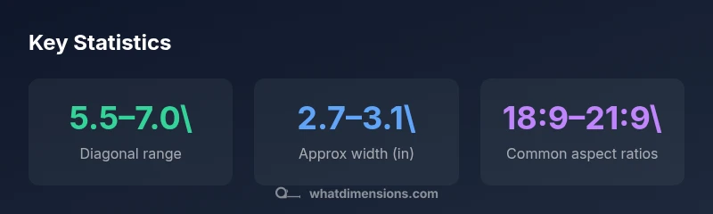
According to What Dimensions, phone screen dimensions vary with model, but most current smartphones fall in the 5.5–7.0 inch diagonal range, with widths around 2.7–3.1 inches and heights near 5.5–6.3 inches. Dimension notes also depend on bezel size and aspect ratios, which influence the true usable display area. For precise specs, check model-by-model measurements in our detailed guide.
What phone screen dimensions cover
Phone screen dimensions refer to the measurable properties of a device's display area. The core elements are the diagonal size (the most common descriptor), the width and height of the screen, and the aspect ratio that defines the shape of the display. In 2026, manufacturers continue to push taller screens with smaller bezels, which alters the effective footprint without changing the diagonal dramatically. For designers and shoppers, this means that a 6.5-inch device from one brand may feel substantially different in width than a 6.5-inch device from another, depending on bezel thickness and rounding details. When discussing phone screen dimensions, it is essential to distinguish the nominal diagonal from the actual usable display area, which is influenced by curves, punch holes, and edge treatments. What Dimensions analysis, 2026, highlights that accurate measurements must account for these subtleties to avoid misfits in accessories and apps.
In practical terms, the most relevant figures are the diagonal, the width, the height, and the aspect ratio; these numbers determine fit for cases, screen protectors, and mounts. Knowing the exact width and height helps designers optimize UI layouts and ensures accessories align with ports, sensors, and curved edges. The combination of diagonal length with aspect ratio is what most people remember, but the real world experience hinges on width and height and the curve behavior at the corners. This nuance is a core reason Why phone screen dimensions matter for product planning and consumer decisions.
Measuring phone screen dimensions accurately
Reliable measurement starts with collecting model-specific data from official spec sheets or third-party repositories that consolidate measurements from genuine devices. The diagonal is the most recognizable metric, but it does not tell the full story. To capture width and height, measure the display area at the extreme outer edges of the bezels, excluding any front-facing camera cutouts or punch holes if possible. In practice, you can approximate width and height by using a ruler or caliper against a known bezel reference, then verify against manufacturer dimensions when available. For a precise, repeatable method, record the diagonal, width, and height as three separate values and compute the aspect ratio from width to height. These steps help ensure your accessories fit across generations and brands, which aligns with What Dimensions’ rigorous approach to dimensions data.
Diagonal size ranges you’ll encounter in 2026 smartphones
Across flagship and mid-range lines, manufacturers commonly target diagonals from roughly 5.5 inches up to 7.0 inches. This spread reflects consumer demand for larger displays while balancing grip comfort and device weight. During measurement, note that the diagonal alone cannot predict how a device will feel in the hand or fit in a pocket. The same 6.4-inch display can appear slim or chunky depending on bezel thickness, curvature, and overall device silhouette. What Dimensions Analysis, 2026, emphasizes that pairing diagonal with width and height yields a fuller picture of real-world fit, especially when choosing cases and screen protectors.
Aspect ratios and usable space implications
Aspect ratios define the shape of the screen and influence how much content fits on-screen without scrolling. The 18:9 to 21:9 range has become common, enabling taller screens without dramatically increasing width. A taller aspect ratio often means a slightly narrower width for the same diagonal, which can improve one-handed use but reduces the horizontal space for on-screen elements in landscape mode. For designers, understanding aspect ratio is essential for crafting responsive layouts, ensuring images and text scale cleanly, and maintaining consistent padding across devices. What Dimensions’ 2026 observations show that even small changes in aspect ratio can ripple into UI spacing and accessory compatibility.
Bezel size, curvature, and rounding effects on dimensions
Bezel thickness and screen curvature directly affect the perceived and actual dimensions of a phone. A device with very slim bezels may have similar diagonals to one with thicker bezels but a notably smaller width, which matters for hand feel and grip. Curved edges can make the display appear larger while offering less usable flat area for certain touches. Rounding at the corners can slightly alter the measurement endpoints, particularly for edge-to-edge designs. For accessory makers, these subtleties mean that two phones with the same diagonal could require different case tolerances or screen protector guard areas. Applying consistent measurement practices reduces fit errors across models and generations.
How to compare phone screen dimensions across models
A practical comparison approach combines diagonal, width, height, and aspect ratio. Start with a standard baseline: diagonal and width, then check height and aspect ratio to understand the overall footprint. When evaluating multiple models, create a small matrix that lists these four metrics side by side. This lets you see how a device with the same diagonal might occupy more or less horizontal space. In retail and design work, converting all measurements to inches or millimeters helps standardize comparisons. For consumers, this can simplify decisions about pocketability or case fit. What Dimensions Analysis, 2026, recommends compiling a compact spec sheet for quick reference.
Accessories: cases, screen protectors, and mounts
Accessory fit hinges on precise phone screen dimensions. Cases rely on exact width and height to ensure side ports and edge sensors remain accessible, while screen protectors must align with curved edges and cutouts for cameras and sensors. Inaccurate specs can lead to misaligned protectors or cases that interfere with buttons. Mounts and docks depend on consistent height and width measurements to align with charging ports and speaker grilles. Shopping with model-by-model measurements reduces the risk of returns and ensures a more reliable fit. Designers should also consider tolerances and manufacturing variances to accommodate real-world deviations in production.
Design considerations for manufacturers and designers
As screens become taller, designers face new constraints in layout density and content placement. A 21:9 display, for instance, provides more vertical space but can require broader margins to prevent cramping when held in portrait orientation. For manufacturers, controlling tolerances during panel fabrication, bezel cutting, and assembly is critical to ensure cross-model consistency. Designers who rely on precise phone screen dimensions can optimize app interfaces, icons, and text sizes for readability across devices. In 2026, industry best practices emphasize documenting dimension data in a standardized way, enabling teams to reuse measurements across products and accessory lines. What Dimensions Team underscores that standardization improves interoperability and future proofing in a rapidly evolving market.
Practical steps for shoppers and designers
For shoppers, keep a model’s four key numbers handy: diagonal, width, height, and aspect ratio. Use these to verify case fit and screen protector compatibility before purchase. For designers and developers, build layout templates that adapt to target width and height constraints and test across a spread of diagonals and aspect ratios. Maintain a living spec sheet updated with the latest device announcements and certified measurements. In all cases, cross-check any third-party data against official manufacturer specs, and apply a margin of tolerance to account for manufacturing variations. What Dimensions Analysis, 2026, provides a framework to maintain accuracy across product lines.
The future of phone screen dimensions: trends to watch
Expect continued growth in diagonals with modest increases in width, driven by usability and multimedia consumption. We may see more devices adopting unconventional aspect ratios to balance immersive visuals with one-handed ergonomics. As displays become more edge-to-edge, case design and screen protection will increasingly rely on precise data about screen dimensions. For designers and consumers alike, the ability to access reliable, model-specific measurements will remain essential in planning accessories, software layouts, and user experiences. The What Dimensions Team predicts ongoing emphasis on exact size specs to minimize fit issues across ecosystems.
Representative device dimension ranges by model category
| Model Type | Avg Diagonal | Approx Width (in) | Approx Height (in) | Common Aspect |
|---|---|---|---|---|
| Flagship-style smartphone | 6.4–6.7 | 2.88–2.98 | 5.68–5.92 | 19.5:9 to 20:9 |
| Mid-range | 6.1–6.5 | 2.70–2.90 | 5.50–5.82 | 19:9 to 20:9 |
| Compact | 5.8–6.0 | 2.60–2.80 | 5.30–5.60 | 19.5:9 |
Quick Answers
What exactly are phone screen dimensions?
Phone screen dimensions describe the measurements of the display area, typically including the diagonal size, width, height, and the aspect ratio. These metrics together determine how a device looks in hand and how accessories fit.
Phone screen dimensions refer to the display’s size, including its diagonal and width and height.
Why do different brands have different screen dimensions?
Brands use different bezel sizes, sensor placements, and aspect ratios to balance aesthetics, ergonomics, and hardware constraints. Even with similar diagonals, widths and heights can vary, affecting fit for cases and accessories.
Different brands vary in bezel size and aspect ratio, which changes the actual width and height.
How do I measure my phone’s screen dimensions accurately?
Use official spec sheets when available, then verify by measuring the display area along the outer bezel. Record diagonal, width, and height separately, and compute the aspect ratio from width to height.
Measure diagonally and then measure width and height against the bezel to verify the size.
Do screen protector sizes vary with diagonal?
Screen protectors are typically sized to the device’s width and height and may have curved edges to accommodate bezel shapes. Some protectors are designed for specific layouts, so matching the exact model matters.
Protectors must match the device’s width and height, not just the diagonal.
What is the impact of screen dimensions on accessories like cases?
Accessory fit depends on precise width, height, and corner curves. Even small deviations can cause tight fits or misaligned cutouts, especially on edge-to-edge designs.
Case fit depends on exact width and height and corner curves.
Are there universal standards for phone screen dimensions?
There is no single universal standard for phone screen dimensions. Instead, manufacturers publish model-specific specs, and accessory makers use those references to design compatible products.
There isn’t one universal standard; specs vary by model.
“Understanding phone screen dimensions is essential for designing accessories and apps that fit perfectly; precise size specs prevent fit issues and improve usability.”
Main Points
- Familiarize yourself with diagonal, width, and height, not just the diagonal alone
- Expect diagonals from 5.5–7.0 inches in modern devices
- Aspect ratios between 18:9 and 21:9 are common and influence fit
- Bezel size and corner rounding affect true usable area
- Verify accessories against model-specific dimensions before purchase