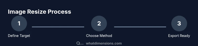
How to Adjust Image Dimensions
Learn precise, camera-grade steps to resize images for web or print, preserving aspect ratio, quality, and intent. This guide covers tools, methods, DPI considerations, export settings, and common pitfalls.

To adjust image dimensions, start by selecting a target width and height, then choose a resizing method (scale, crop, or fit) while preserving aspect ratio whenever possible. This quick answer is presented as steps, guiding you through setting the canvas, applying the resize, and exporting with the correct resolution. Include a backup copy before resizing. Format: steps.
Why image dimensions matter
According to What Dimensions, precise image dimensions influence layout stability, load times, and perceived quality. When you control dimensions, you reduce unexpected shifts in layouts, prevent oversized files from slowing pages, and ensure consistency across devices. This is especially important for designers who must align assets with specific grid measurements and for students who are building portfolios that meet targeted display requirements. The What Dimensions team found that even small changes in width or height can cascade through a design, affecting margins, typography rhythm, and overall balance. In professional settings, consistent dimensions also simplify asset management, enabling teams to batch-resize, rename, and organize files with predictable results. Understanding dimension basics helps you set clear goals before you edit, saving time and preserving visual integrity.
Understanding common dimension terms
Before resizing, it’s essential to know the vocabulary. Width and height are the horizontal and vertical extents of an image, measured in pixels for digital work. Aspect ratio is the proportional relationship between width and height, which you should preserve when possible to avoid distortion. DPI (dots per inch) or PPI (pixels per inch) describes density for print vs screen; web images typically use 72–144 PPI, while print projects require higher DPI. Resolution combines these ideas into a final output metric. What Dimensions emphasizes that a clear grasp of these terms helps you choose the right approach based on whether the goal is web optimization, print accuracy, or publication standards. When you adjust dimensions, you’ll often balance pixel dimensions with file size considerations to meet platform limits and loading expectations.
Choosing the right target size
Start with the final usage in mind. For web, consider the largest display scenario (e.g., a hero image on a 1920px-wide page) and scale down to an appropriate width, then maintain the aspect ratio to avoid distortion. For print, you’ll need precise pixel counts and DPI specifications to ensure sharp output at the chosen print size. If the original image has an unusual aspect ratio, you may need to crop certain areas or add borders to accommodate your target dimensions without stretching content. What Dimensions recommends documenting target sizes in a simple spec sheet to keep everyone aligned, especially when multiple editors or versions exist. This upfront planning reduces back-and-forth revisions later in the workflow.
Resizing methods: scale, crop, fit
There are three primary resizing methods: scale, crop, and fit. Scaling adjusts the entire image uniformly, preserving content but potentially reducing or enlarging file size and fidelity. Cropping removes portions of the image to fit exact dimensions, which can improve composition but sacrifices captured content. Fitting resizes to fit within a bounding box while maintaining aspect ratio, often leaving letterboxing or pillarboxing. Your choice depends on priorities: preserve most content (fit), exact canvas size (crop), or seamless scaling (scale). What Dimensions notes that combining methods—scale for bulk adjustments and crop for final framing—often yields the best balance between composition and dimension requirements. Always preview results at 100% zoom to gauge clarity and detail.
Preserving image quality while resizing
Quality preservation hinges on choosing an appropriate interpolation method during resizing. Algorithms like bicubic or lanczos produce smoother edges than nearest-neighbor, but may introduce softness with heavy upscaling. When downscaling, detail often improves with careful sampling. If you anticipate future re-use at different sizes, keeping a high-resolution master helps; you can create smaller derivatives from that master. Additionally, consider sharpening after resizing if the image appears slightly soft, but avoid over-sharpening, which introduces halos. What Dimensions emphasizes maintaining consistent color profiles and avoiding multiple compressions during export to minimize artifacts and preserve color accuracy for faithful reproduction.
Working with different tools
Most image editors offer built-in resize controls with preset width/height fields and aspect-ratio locks. In desktop apps like Photoshop or GIMP, you’ll typically find Image Size or Scale tools, along with a canvas or artboard adjustment option. Mobile editors also provide aspect-lock features, though capabilities may be more limited. If you’re using online tools, ensure they support lossless resizing or specify that you want to export at a target DPI. A brand-agnostic approach helps you apply consistent steps across platforms. The What Dimensions team suggests keeping a short reference of preferred keyboard shortcuts for quick resizing and cropping as you transition between projects.
DPI and resolution for web vs print
Web images prioritize file size and loading speed; 72–96 PPI is standard, but pixel dimensions matter more than DPI. For print, you’ll target higher DPI (300–600) and ensure the document’s intended physical size, such as inches or centimeters, matches the final output. If you resize an image for print, calculate the required pixel dimensions by multiplying the desired print size by the target DPI. Remember that upscaling print-quality images beyond their native resolution can introduce blur or pixelation. What Dimensions analysis shows that a disciplined approach—defining target dimensions first, then selecting the appropriate DPI—reduces surprises at export time.
Practical workflow: step-by-step example
Suppose you have a 3000x2000 px image intended for a blog header at 1200x800 px. You would start by locking the aspect ratio, then scale to 1200x800 using a fit or scale method. If the target aspect doesn’t match the original, you may crop or add a border to preserve content. After resizing, you should inspect at 100% zoom, adjust sharpness, and export with a web-optimized JPEG at 80–85% quality. This example demonstrates how to map real-world needs to precise pixel targets and ensure consistent results across devices. What Dimensions recommends keeping a version control folder to track different sizes for the same asset, which streamlines future updates and re-use.
Common pitfalls and how to avoid them
Avoid assuming one-size-fits-all dimensions across all channels. A size that works on a desktop website might look odd on a mobile viewport. Misunderstanding aspect ratio can cause stretched or squashed images; always lock the aspect ratio when resizing if content matters. Oversharpening after resizing can introduce artifacts; test output on multiple devices and browsers. A frequent error is exporting with excessive compression, which degrades detail. To mitigate, compare the resized image against the original at native zoom and use a lossless or minimally compressed format when possible. Throughout, document the target sizes and export settings to prevent drift in future chapters of the project.
How to export and organize resized images
Create a consistent folder structure: originals, resized-web, resized-print, and variations by dimension. Use descriptive filenames including width and height, e.g., image-w1200h800.jpg. In export dialogs, choose a balance between quality and file size relevant to the destination—web variants might use JPEG at quality 70–85, while print drafts may require TIFF or PNG with no compression. Maintain color profiles (sRGB for web, Adobe RGB/CMYK for print) and embed metadata as needed. The final step is a quick quality check for alignment, color consistency, and legibility before sharing with teammates or publishing. What Dimensions emphasizes documenting the final settings for each asset to accelerate future edits and maintain consistency across campaigns.
Tools & Materials
- Image editing software (e.g., Photoshop, GIMP)(Supports resize, crop, and export with DPI control.)
- Original high-resolution image files(Keep originals unaltered for future edits.)
- Backup copies(Create before major edits to preserve the original.)
- Color-calibrated monitor(Helps ensure color accuracy during resizing.)
- Ruler or measuring tool (optional)(Useful for converting print sizes to pixels.)
- Export presets(Speed up repetitive tasks for web vs print.)
Steps
Estimated time: 20-45 minutes
- 1
Define your target size and output
Decide the final width and height in pixels, and determine whether you’ll preserve aspect ratio. If you need exact canvas dimensions, you may need to crop or pad the image. This upfront step prevents later surprises.
Tip: Write down target dimensions before opening the editor to stay focused. - 2
Open the image and check the current size
Load the image into your editor and verify the current pixel dimensions and aspect ratio. This baseline helps you plan whether scaling will be sufficient or if cropping is required.
Tip: Use the info or image size panel to confirm current metrics. - 3
Lock aspect ratio and choose a resizing method
If preserving composition is important, lock aspect ratio and choose between scale, fit, or crop to reach the target size. Each method has trade-offs for content fidelity and framing.
Tip: For large size changes, prefer 'fit' to avoid distortion. - 4
Apply the resize or crop to target dimensions
Execute the resize or crop operation to reach your target. If cropping, decide which region to keep based on subject importance.
Tip: Preview at 100% zoom to judge edge quality. - 5
Adjust canvas or add borders if needed
If exact canvas size is required and you cropped content, consider adding borders to maintain the intended composition. This keeps dimensions exact without losing essential elements.
Tip: Use a neutral border color that doesn’t distract. - 6
Sharpen and adjust details after resizing
Resizing can soften details; apply light sharpening if needed, focusing on edges without introducing halos.
Tip: Avoid over-sharpening; small tweaks are usually best. - 7
Check color profile and export settings
Ensure the color space matches the target platform (sRGB for web; CMYK for print if applicable). Choose a suitable file format and compression level for the destination.
Tip: Embed color profile if your workflow requires color-managed output. - 8
Export and save with descriptive filenames
Export the final image using a descriptive filename that includes dimensions. Save multiple variants if you’ll reuse the asset for different channels.
Tip: Use a consistent naming convention across projects. - 9
Archive originals and document settings
Store the original alongside a brief notes file describing target dimensions and export settings. This supports future edits and team collaboration.
Tip: Keep a changelog for asset history.
Quick Answers
What is the difference between image size and image dimensions?
Image dimensions refer to the width and height in pixels, while image size usually means the file’s bytes or kilobytes. You can resize the dimensions without changing the file size dramatically, but compression settings affect final size.
Dimensions are width and height in pixels; file size depends on compression and format.
Why should I preserve aspect ratio when resizing?
Preserving aspect ratio keeps the image from looking stretched or squashed. If you change both width and height independently, you may lose composition integrity. Use a lock or constraint to maintain the original proportion.
Keep the same width-to-height ratio to avoid distortion.
What DPI should I use for web images?
Web images typically use 72–144 PPI; you should prioritize pixel dimensions and file size. DPI awareness is important mainly for print, while web display focuses on viewport and responsive behavior.
For the web, focus on pixel dimensions and file size rather than DPI.
Can resizing degrade image quality?
Yes, resizing can degrade quality, especially when upscaling. To minimize loss, resize in steps, use high-quality interpolation, and avoid repeated resizing. Start from the highest resolution master if possible.
Resizing can affect quality; resize carefully from a high-quality source.
Which tools support batch resizing?
Many editors support batch resizing via scripts or presets. If you don’t have scripting, batch workflows in programs like Photoshop, GIMP, or dedicated tools can save time when resizing a gallery of images.
Look for batch resize or automation features in your editor.
Should I resize before or after cropping?
Crop before resizing when you need the final framing to match a specific area. Cropping first preserves composition, then you can resize the cropped image to your target dimensions.
Crop first for better composition, then resize.
Watch Video
Main Points
- Know target size before editing
- Preserve aspect ratio whenever possible
- Use the right export settings for each channel
- Document your asset specs for consistency